menu
daily bread food bank improving donations
daily bread food bank improving donations
daily bread food bank improving donations
daily bread food bank improving donations
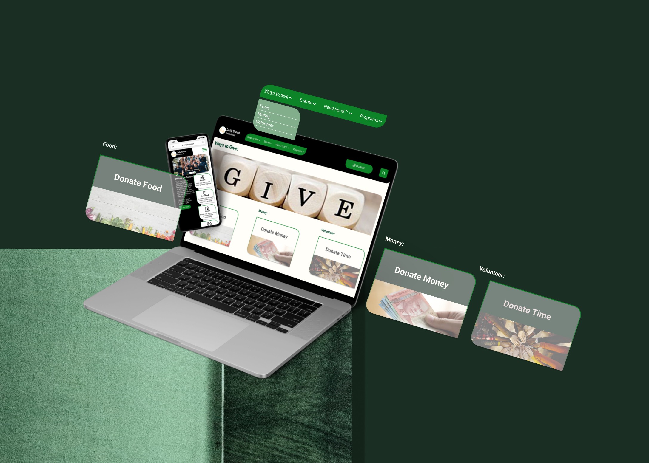
a non-profit organization’s website redesign aims to help the charity increase donations while making the donors feel comfortable with the multiple ways of giving.
a non-profit organization’s website redesign aims to help the charity increase donations while making the donors feel comfortable with the multiple ways of giving.
a non-profit organization’s website redesign aims to help the charity increase donations while making the donors feel comfortable with the multiple ways of giving.
a non-profit organization’s website redesign aims to help the charity increase donations while making the donors feel comfortable with the multiple ways of giving.
00
00

00

00

problem
Many individuals strongly prefer donating food over donating money or time to food banks. This observed trend hinders the charity's overall donation growth and limits the flexibility of donors.
solution
To address the challenge of limited donation diversity and enhance donor comfort, our proposed solution involves the development of a comprehensive and user-friendly donation platform. This platform will feature: - Personalized giving options: - educational content - transparent tracking of donations - User-centric design - Shoping cart for buy the most needed items
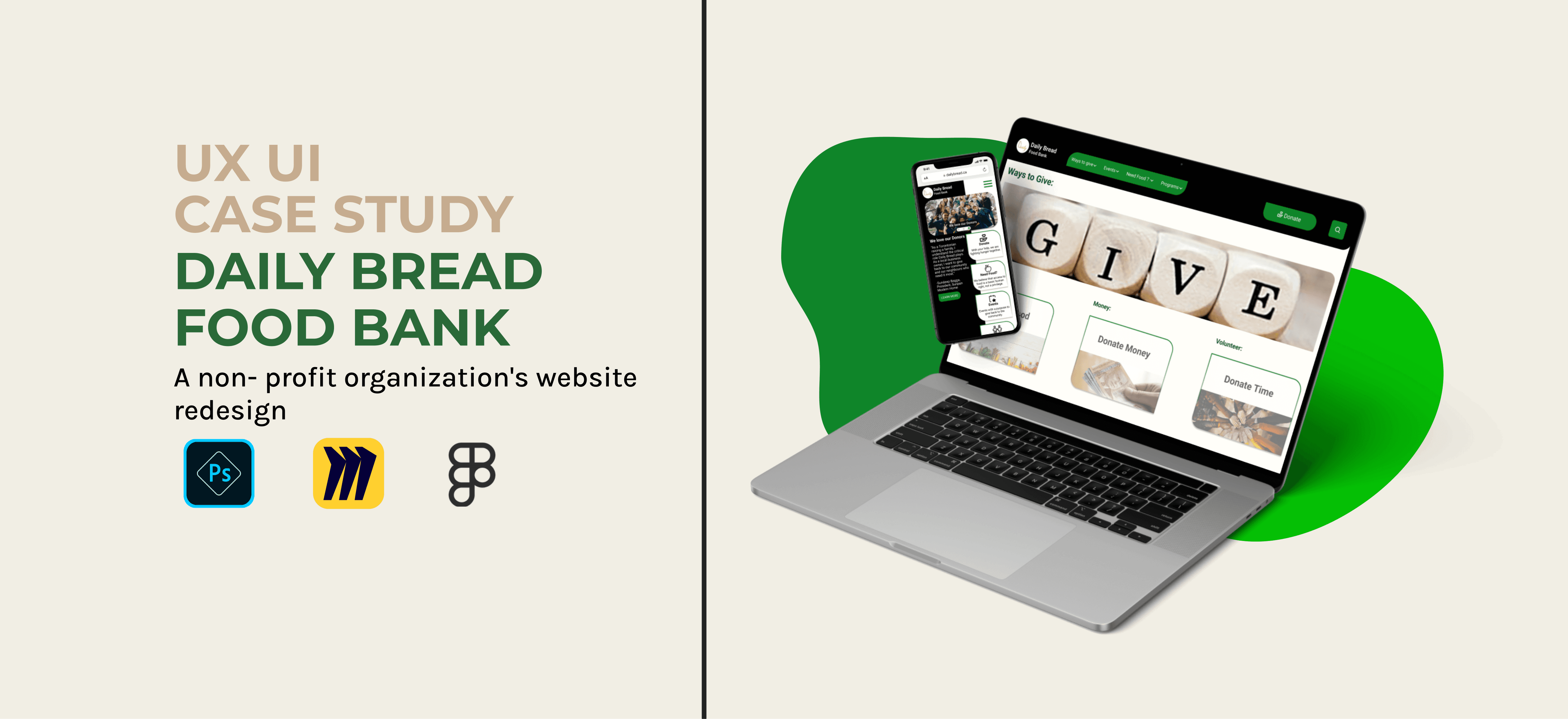
Revitalizing the online presence of the Daily Bread Food Bank, a non-profit committed to eradicating hunger and food insecurity, was the focus of this transformative UX case study.
Our mission is to elevate user experience and increase donations through a comprehensive website redesign.
In this collaborative endeavor, a dynamic team of three skilled UX Designers embarked on a transformative bootcamp project. Our primary goal was twofold: to enhance the donor's experience and comfort with various giving options, ultimately leading to increased contributions.
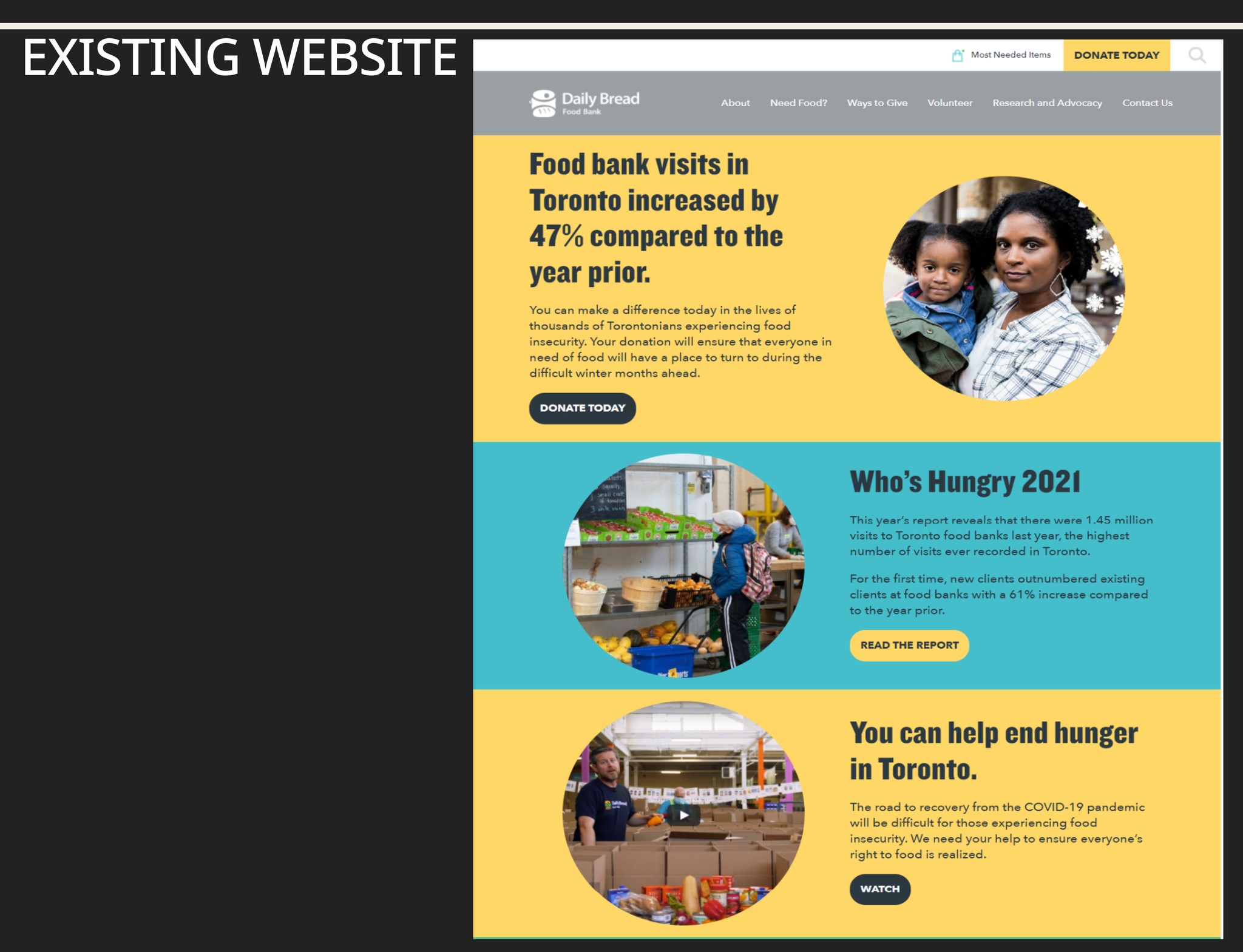
What is daily bread and why does it need a redesign?"Daily Bread" Food Bank is a non-profit, charitable organization fighting to end hunger in our communities in Toronto, working on long-term solutions to end poverty while providing food to 200 food programs across Toronto. We decided to redesign it for our Bootcamp project because we wanted to :
1. Work on cause we felt connected to
2. Improve the user experience
3. Improved Information Accessibility
4. Streamlined Donation Process
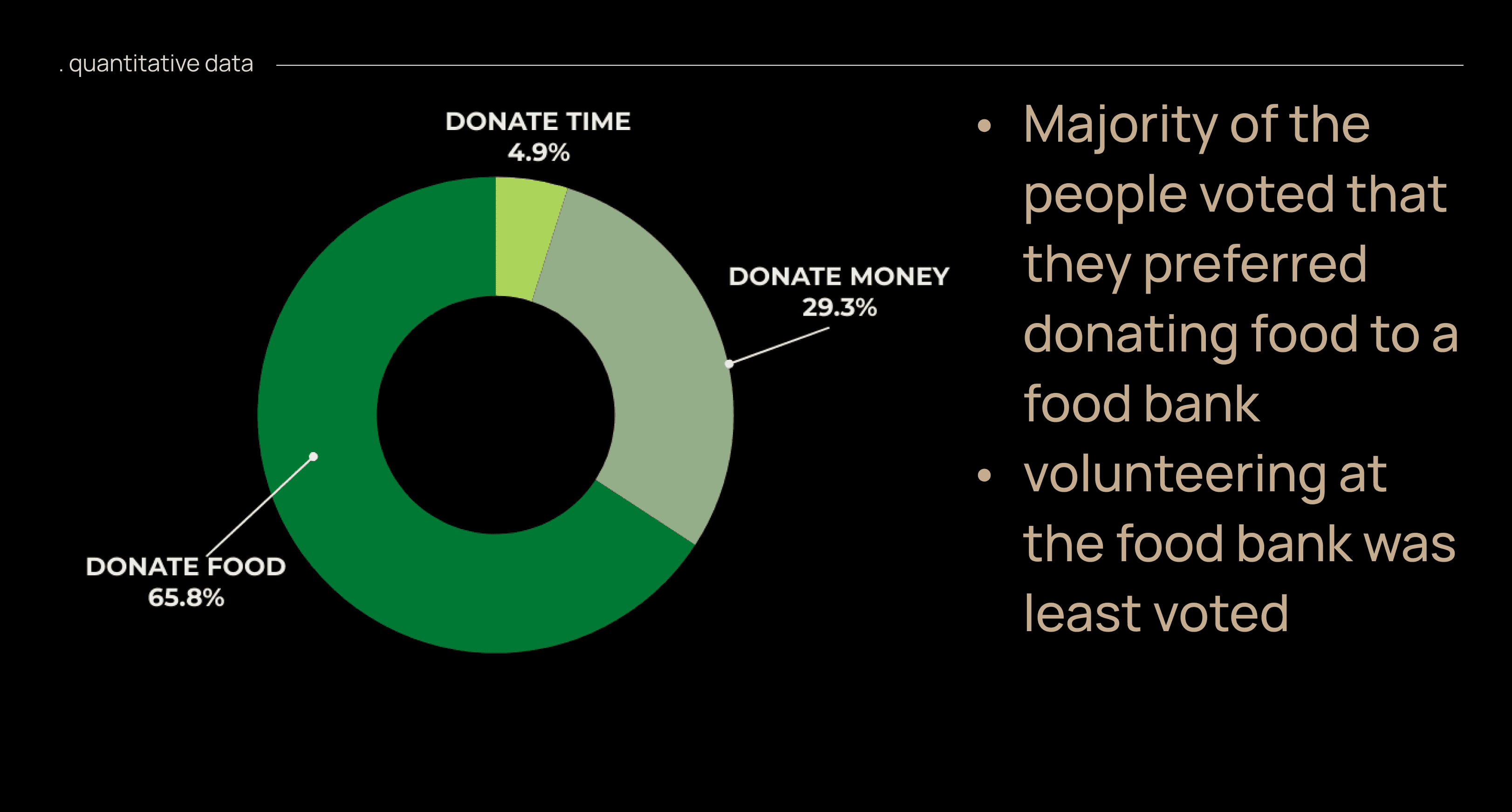
Survey: We observed that potential donors felt more comfortable donating food rather than money or time to the food bank. the results also indicated that the receivers looked for help from online platforms.
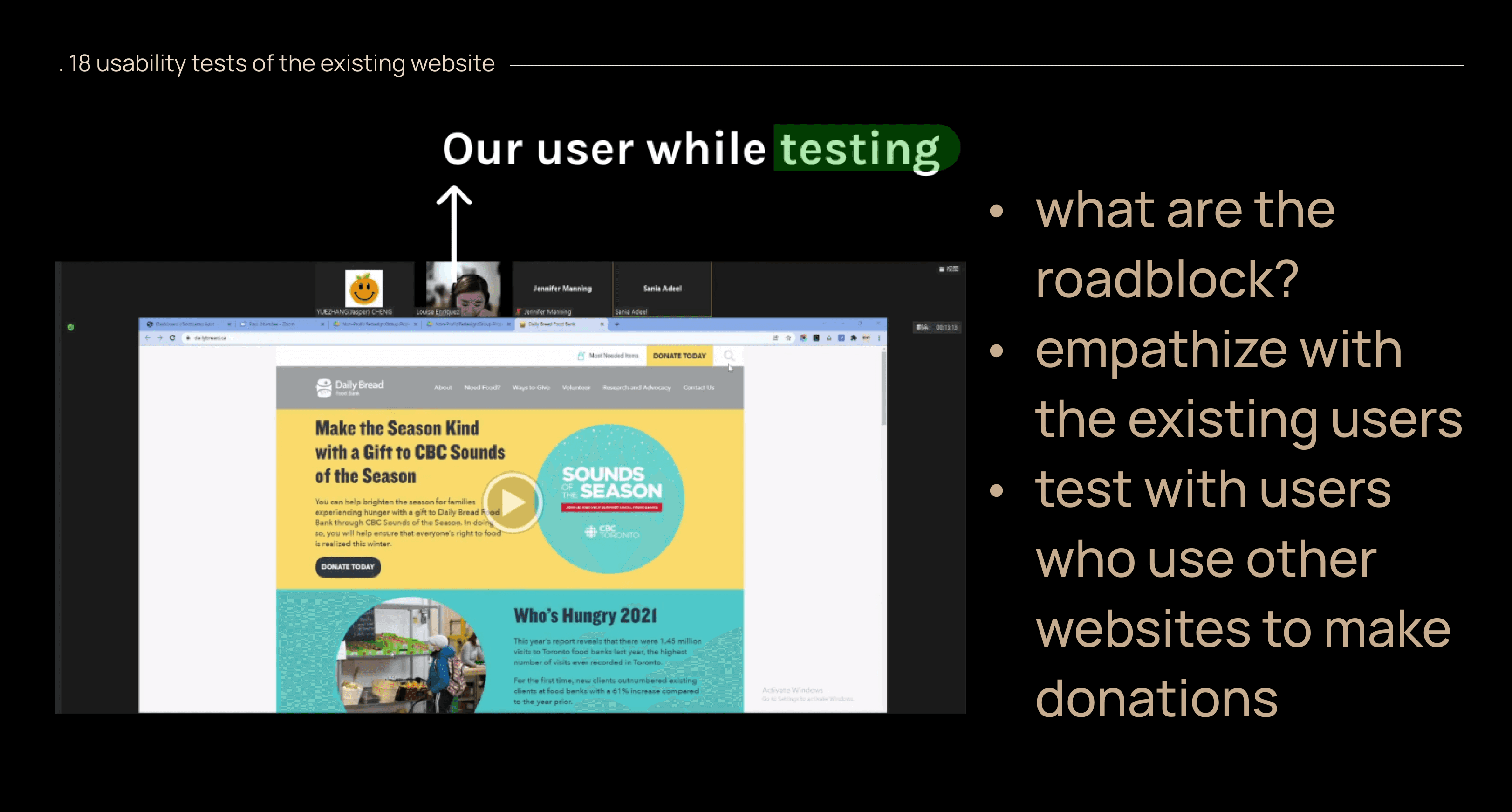
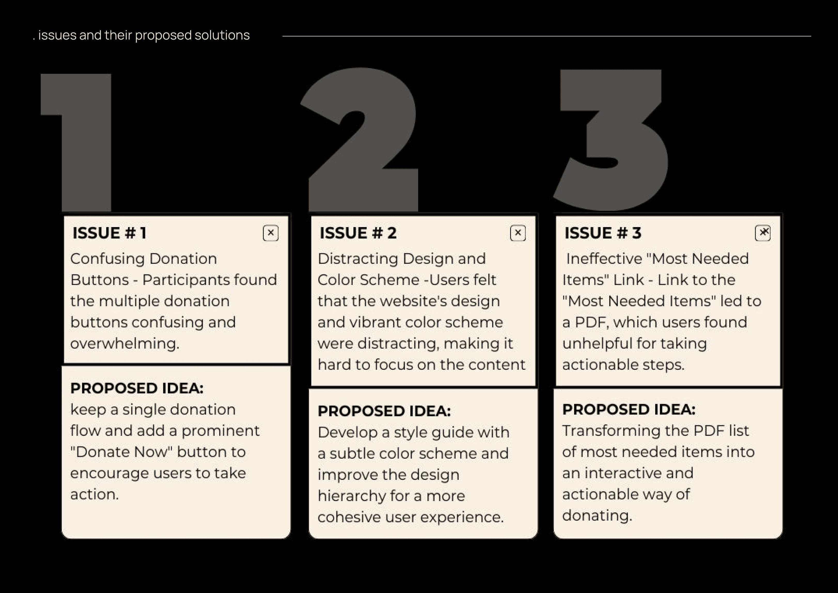
18 User Tests During Early Research Phase: We wanted to know how our users experienced the existing website and therefore having usability tests performed we came up with the following predominant feedback:
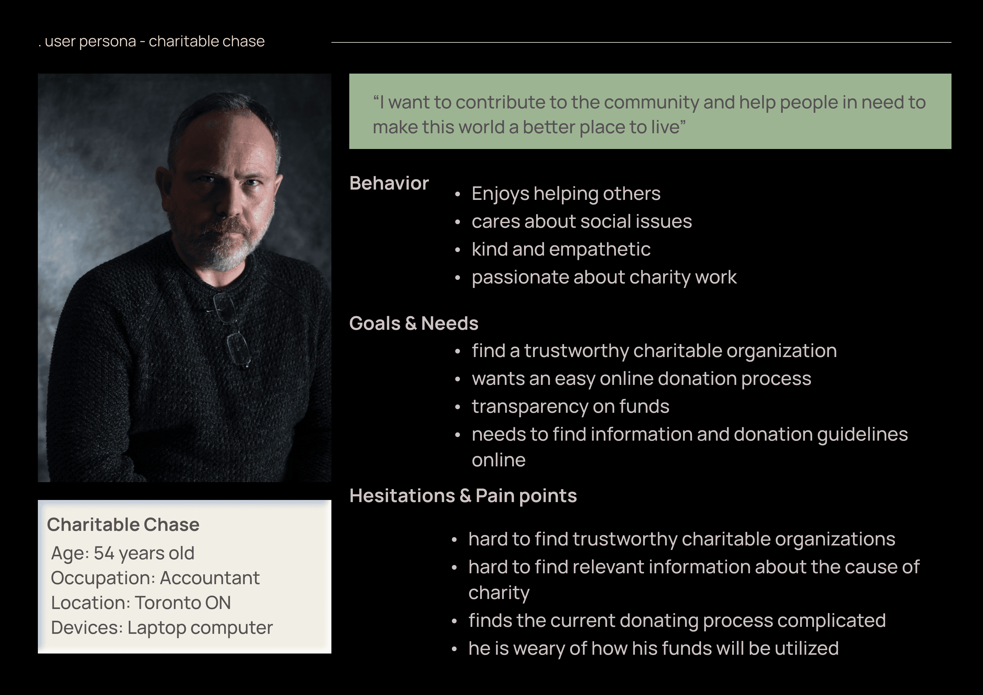
In the early design stages, our team focused on understanding user needs, behaviors, and experiences. We created two personas, "Charitable Chase" and "Needful Ned", based on meticulous research of the existing website design, and prioritized "Charitable Chase" as our primary user. We focused on Charitable Chase as our user of the website.
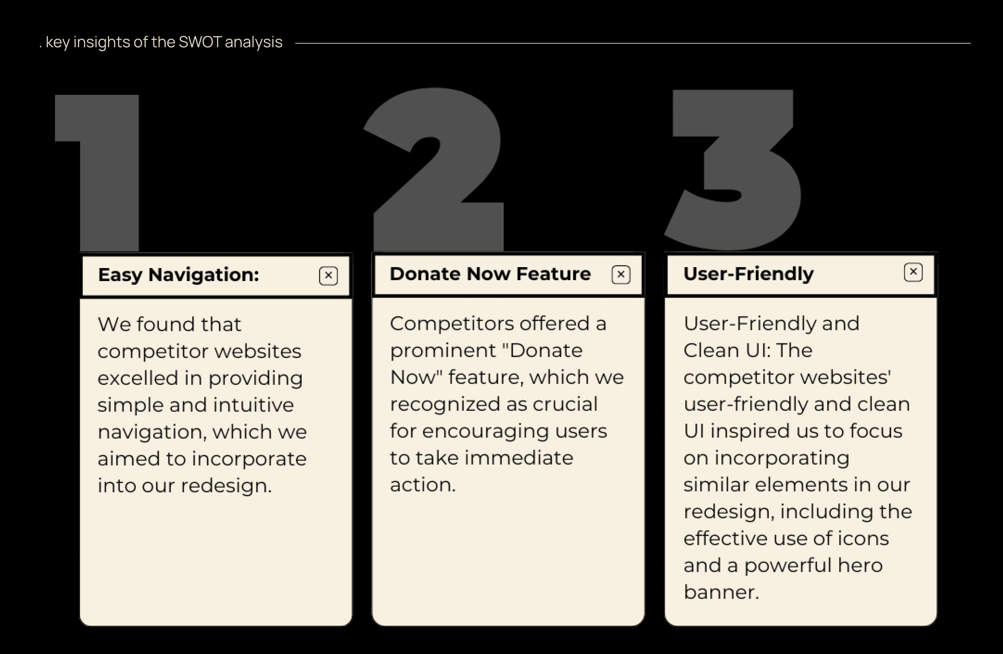
The brainstorming sessions within our collaborative team discussions shaped the outcomes of the design strategy and problem-solving for the existing problem at hand. During the SWOT and competitor analysis, we identified several valuable insights that shaped our proposed solution:
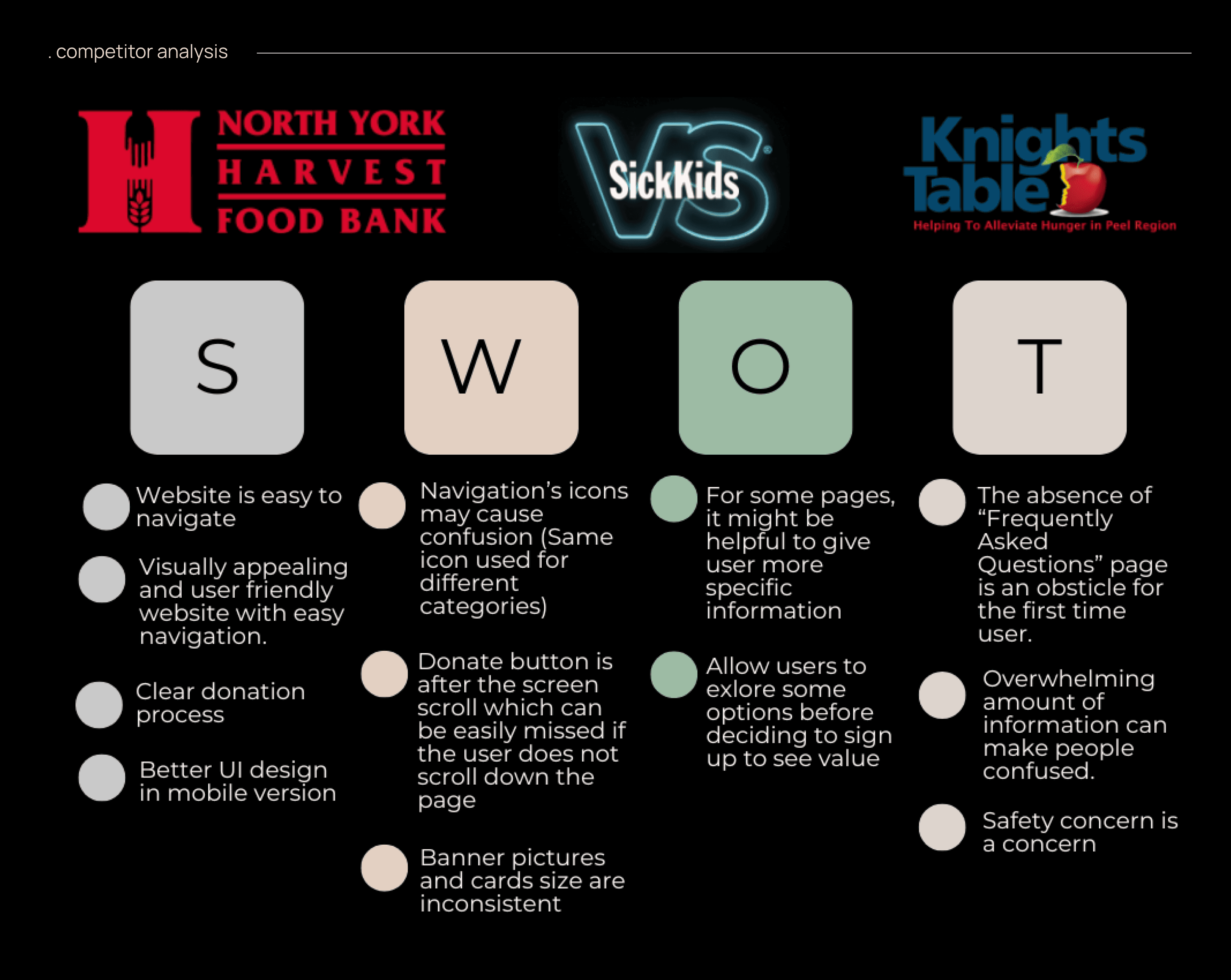
SWOT analysis amongst three competitors, i.e. North York Harvest, Sick Kids, and Knights Table.
Conducting a heuristic evaluation allowed us to explore the existing website thoroughly. We discovered several issues that needed attention. To align the site's information architecture with user expectations, we conducted open card sorting sessions as a team. Keeping "Charitable Chase" in mind, we grouped the 9 categories into smaller, intuitive clusters under global headers, main navigation, and secondary navigation. This new information architecture focused on our user's primary objectives, streamlining their website journey. heuristic evaluation findings through red line annotation
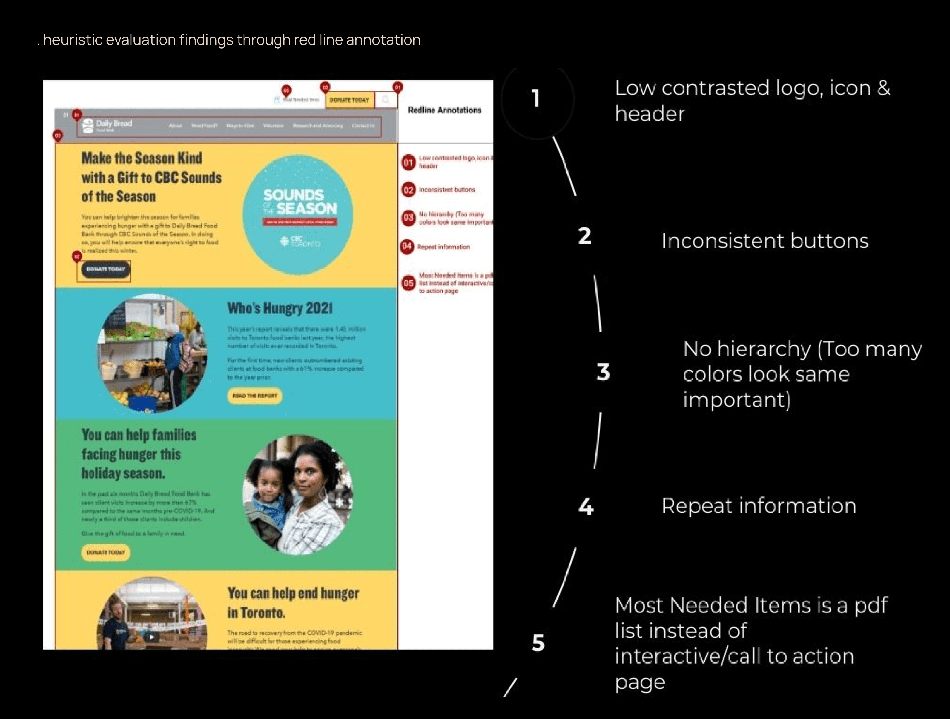
Heuristic evaluation findings through red line annotation
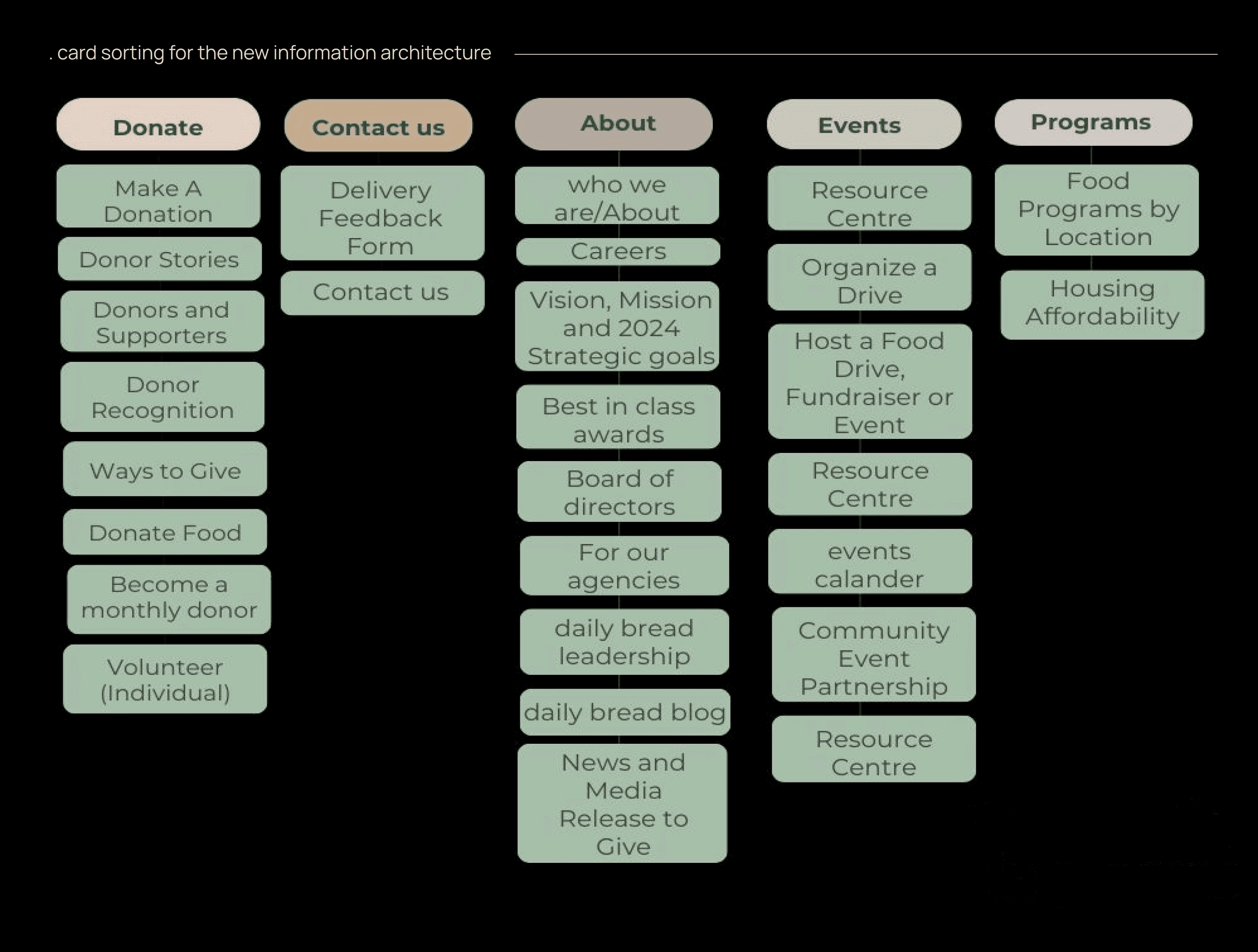
We need to create a new Information Architecture that includes "Donate Now" in the primary navigation
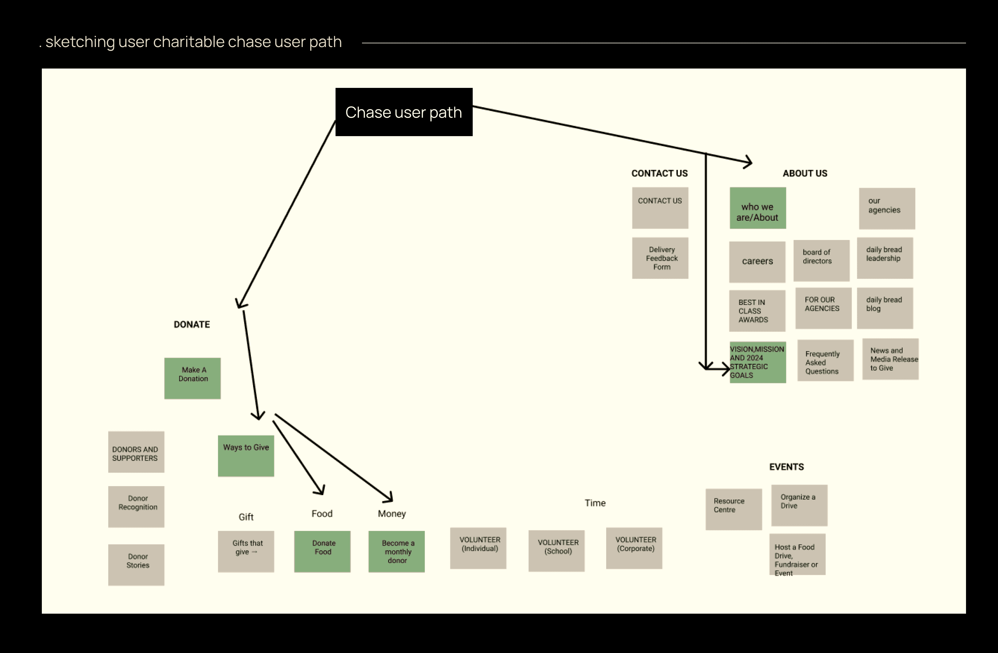
type
Non Profit Website Redesign
timeframe
4 weeks
tools
Figma, Miro
category
UI/UX

Revitalizing the online presence of the Daily Bread Food Bank, a non-profit committed to eradicating hunger and food insecurity, was the focus of this transformative UX case study.
Our mission is to elevate user experience and increase donations through a comprehensive website redesign.
In this collaborative endeavor, a dynamic team of three skilled UX Designers embarked on a transformative bootcamp project. Our primary goal was twofold: to enhance the donor's experience and comfort with various giving options, ultimately leading to increased contributions.


What is daily bread and why does it need a redesign?"Daily Bread" Food Bank is a non-profit, charitable organization fighting to end hunger in our communities in Toronto, working on long-term solutions to end poverty while providing food to 200 food programs across Toronto. We decided to redesign it for our Bootcamp project because we wanted to :
1. Work on cause we felt connected to
2. Improve the user experience
3. Improved Information Accessibility
4. Streamlined Donation Process

Survey: We observed that potential donors felt more comfortable donating food rather than money or time to the food bank. the results also indicated that the receivers looked for help from online platforms.


18 User Tests During Early Research Phase: We wanted to know how our users experienced the existing website and therefore having usability tests performed we came up with the following predominant feedback:

In the early design stages, our team focused on understanding user needs, behaviors, and experiences. We created two personas, "Charitable Chase" and "Needful Ned", based on meticulous research of the existing website design, and prioritized "Charitable Chase" as our primary user. We focused on Charitable Chase as our user of the website.

The brainstorming sessions within our collaborative team discussions shaped the outcomes of the design strategy and problem-solving for the existing problem at hand. During the SWOT and competitor analysis, we identified several valuable insights that shaped our proposed solution:

SWOT analysis amongst three competitors, i.e. North York Harvest, Sick Kids, and Knights Table.

Conducting a heuristic evaluation allowed us to explore the existing website thoroughly. We discovered several issues that needed attention. To align the site's information architecture with user expectations, we conducted open card sorting sessions as a team. Keeping "Charitable Chase" in mind, we grouped the 9 categories into smaller, intuitive clusters under global headers, main navigation, and secondary navigation. This new information architecture focused on our user's primary objectives, streamlining their website journey. heuristic evaluation findings through red line annotation

Heuristic evaluation findings through red line annotation

We need to create a new Information Architecture that includes "Donate Now" in the primary navigation

type
Non Profit Website Redesign
timeframe
4 weeks
tools
Figma, Miro
category
UI/UX

Revitalizing the online presence of the Daily Bread Food Bank, a non-profit committed to eradicating hunger and food insecurity, was the focus of this transformative UX case study.
Our mission is to elevate user experience and increase donations through a comprehensive website redesign.
In this collaborative endeavor, a dynamic team of three skilled UX Designers embarked on a transformative bootcamp project. Our primary goal was twofold: to enhance the donor's experience and comfort with various giving options, ultimately leading to increased contributions.


What is daily bread and why does it need a redesign?"Daily Bread" Food Bank is a non-profit, charitable organization fighting to end hunger in our communities in Toronto, working on long-term solutions to end poverty while providing food to 200 food programs across Toronto. We decided to redesign it for our Bootcamp project because we wanted to :
1. Work on cause we felt connected to
2. Improve the user experience
3. Improved Information Accessibility
4. Streamlined Donation Process

Survey: We observed that potential donors felt more comfortable donating food rather than money or time to the food bank. the results also indicated that the receivers looked for help from online platforms.


18 User Tests During Early Research Phase: We wanted to know how our users experienced the existing website and therefore having usability tests performed we came up with the following predominant feedback:

In the early design stages, our team focused on understanding user needs, behaviors, and experiences. We created two personas, "Charitable Chase" and "Needful Ned", based on meticulous research of the existing website design, and prioritized "Charitable Chase" as our primary user. We focused on Charitable Chase as our user of the website.

The brainstorming sessions within our collaborative team discussions shaped the outcomes of the design strategy and problem-solving for the existing problem at hand. During the SWOT and competitor analysis, we identified several valuable insights that shaped our proposed solution:

SWOT analysis amongst three competitors, i.e. North York Harvest, Sick Kids, and Knights Table.

Conducting a heuristic evaluation allowed us to explore the existing website thoroughly. We discovered several issues that needed attention. To align the site's information architecture with user expectations, we conducted open card sorting sessions as a team. Keeping "Charitable Chase" in mind, we grouped the 9 categories into smaller, intuitive clusters under global headers, main navigation, and secondary navigation. This new information architecture focused on our user's primary objectives, streamlining their website journey. heuristic evaluation findings through red line annotation

Heuristic evaluation findings through red line annotation

We need to create a new Information Architecture that includes "Donate Now" in the primary navigation

type
Non Profit Website Redesign
timeframe
4 weeks
tools
Figma, Miro
category
UI/UX

Revitalizing the online presence of the Daily Bread Food Bank, a non-profit committed to eradicating hunger and food insecurity, was the focus of this transformative UX case study.
Our mission is to elevate user experience and increase donations through a comprehensive website redesign.
In this collaborative endeavor, a dynamic team of three skilled UX Designers embarked on a transformative bootcamp project. Our primary goal was twofold: to enhance the donor's experience and comfort with various giving options, ultimately leading to increased contributions.


What is daily bread and why does it need a redesign?"Daily Bread" Food Bank is a non-profit, charitable organization fighting to end hunger in our communities in Toronto, working on long-term solutions to end poverty while providing food to 200 food programs across Toronto. We decided to redesign it for our Bootcamp project because we wanted to :
1. Work on cause we felt connected to
2. Improve the user experience
3. Improved Information Accessibility
4. Streamlined Donation Process

Survey: We observed that potential donors felt more comfortable donating food rather than money or time to the food bank. the results also indicated that the receivers looked for help from online platforms.


18 User Tests During Early Research Phase: We wanted to know how our users experienced the existing website and therefore having usability tests performed we came up with the following predominant feedback:

In the early design stages, our team focused on understanding user needs, behaviors, and experiences. We created two personas, "Charitable Chase" and "Needful Ned", based on meticulous research of the existing website design, and prioritized "Charitable Chase" as our primary user. We focused on Charitable Chase as our user of the website.

The brainstorming sessions within our collaborative team discussions shaped the outcomes of the design strategy and problem-solving for the existing problem at hand. During the SWOT and competitor analysis, we identified several valuable insights that shaped our proposed solution:

SWOT analysis amongst three competitors, i.e. North York Harvest, Sick Kids, and Knights Table.

Conducting a heuristic evaluation allowed us to explore the existing website thoroughly. We discovered several issues that needed attention. To align the site's information architecture with user expectations, we conducted open card sorting sessions as a team. Keeping "Charitable Chase" in mind, we grouped the 9 categories into smaller, intuitive clusters under global headers, main navigation, and secondary navigation. This new information architecture focused on our user's primary objectives, streamlining their website journey. heuristic evaluation findings through red line annotation

Heuristic evaluation findings through red line annotation

We need to create a new Information Architecture that includes "Donate Now" in the primary navigation

type
Non Profit Website Redesign
timeframe
4 weeks
tools
Figma, Miro
category
UI/UX
.putting the pieces together proposing solutions
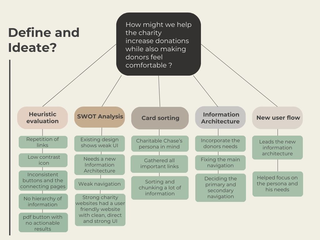
.putting the pieces together proposing solutions

.putting the pieces together proposing solutions

.putting the pieces together proposing solutions

Primary areas of focus that needed to change in the redesign were:
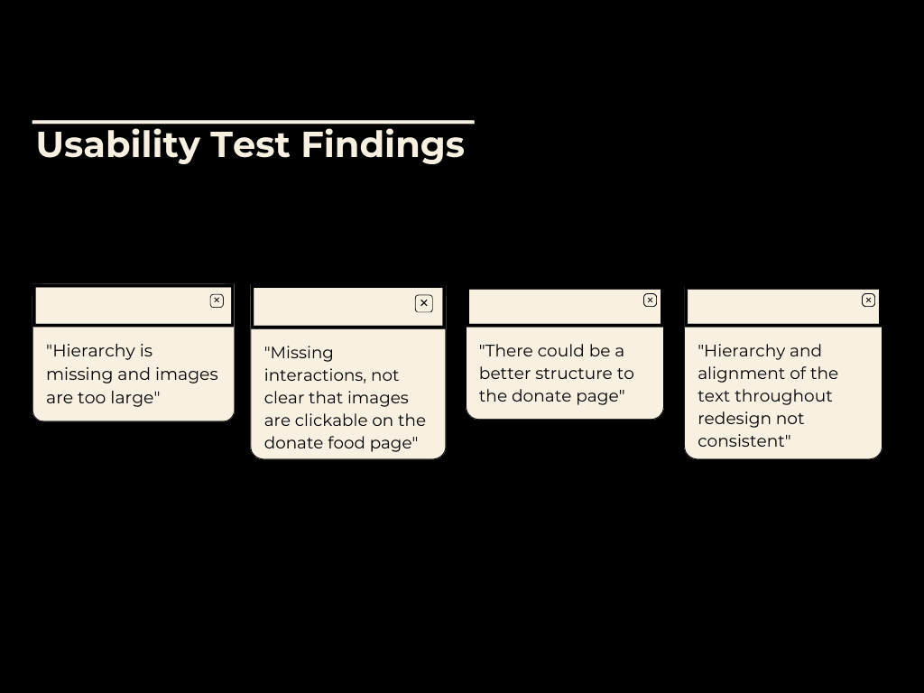
After doing a usability test with multiple users, we made some iterations to the mid-fidelity prototype:
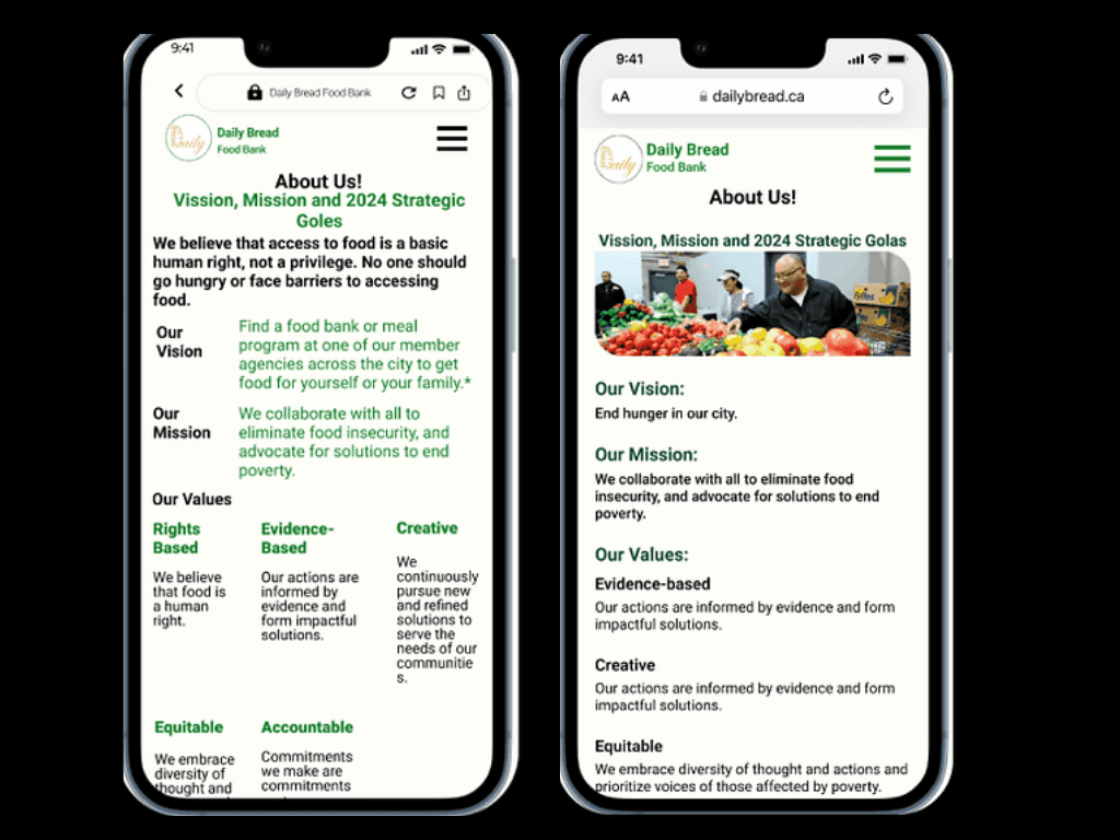
1. Iterations made to the design layout: Unify the design:
Corrected the accessibility and alignment issues in the text on the prototypes, resulting in a harmonized design style. The implementation of a style guide played a pivotal role in unifying the overall design, introducing coherence seamlessly across the entire interface.
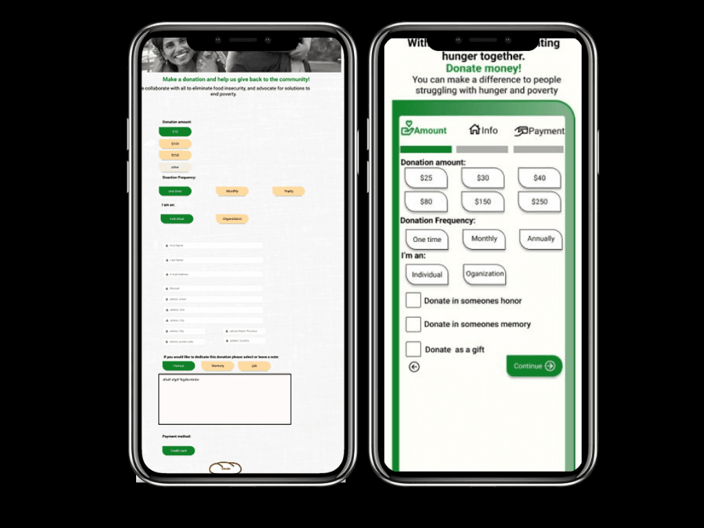
2. Redesign of "Donate Money" flow
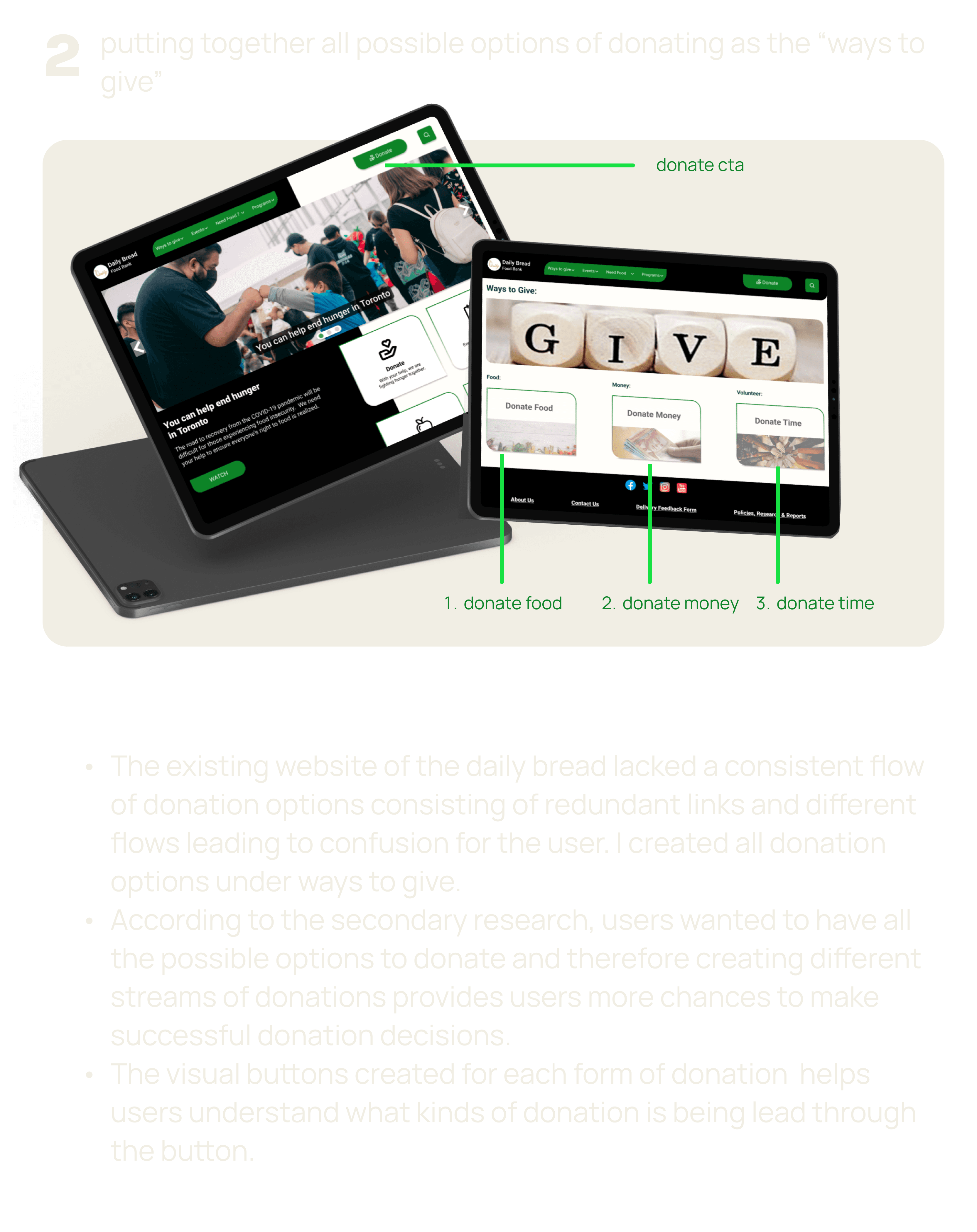
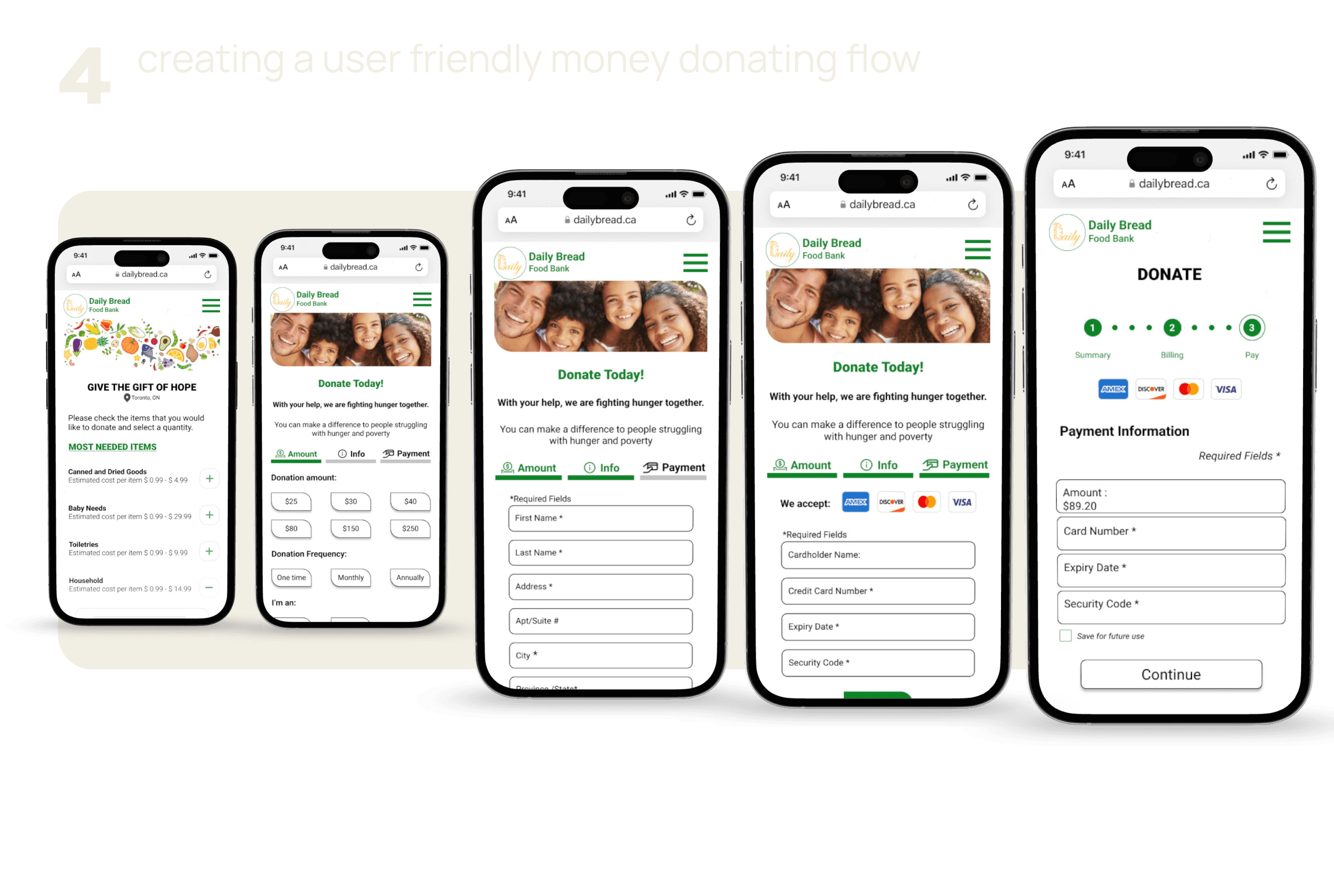
Iterations were made to the user flow of the page “ways to give” and “money donation ” based on users' inability to proceed with the various methods of “giving”, leaving options unnoticed and finding it difficult to navigate through the interactive imagery.
01
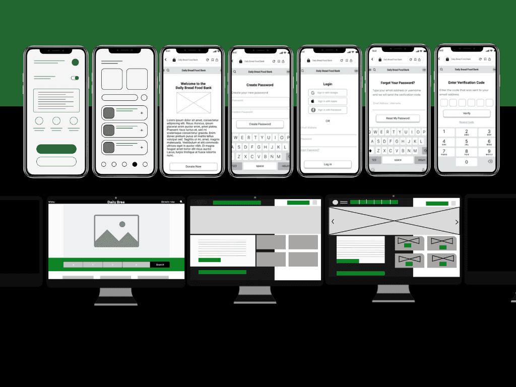
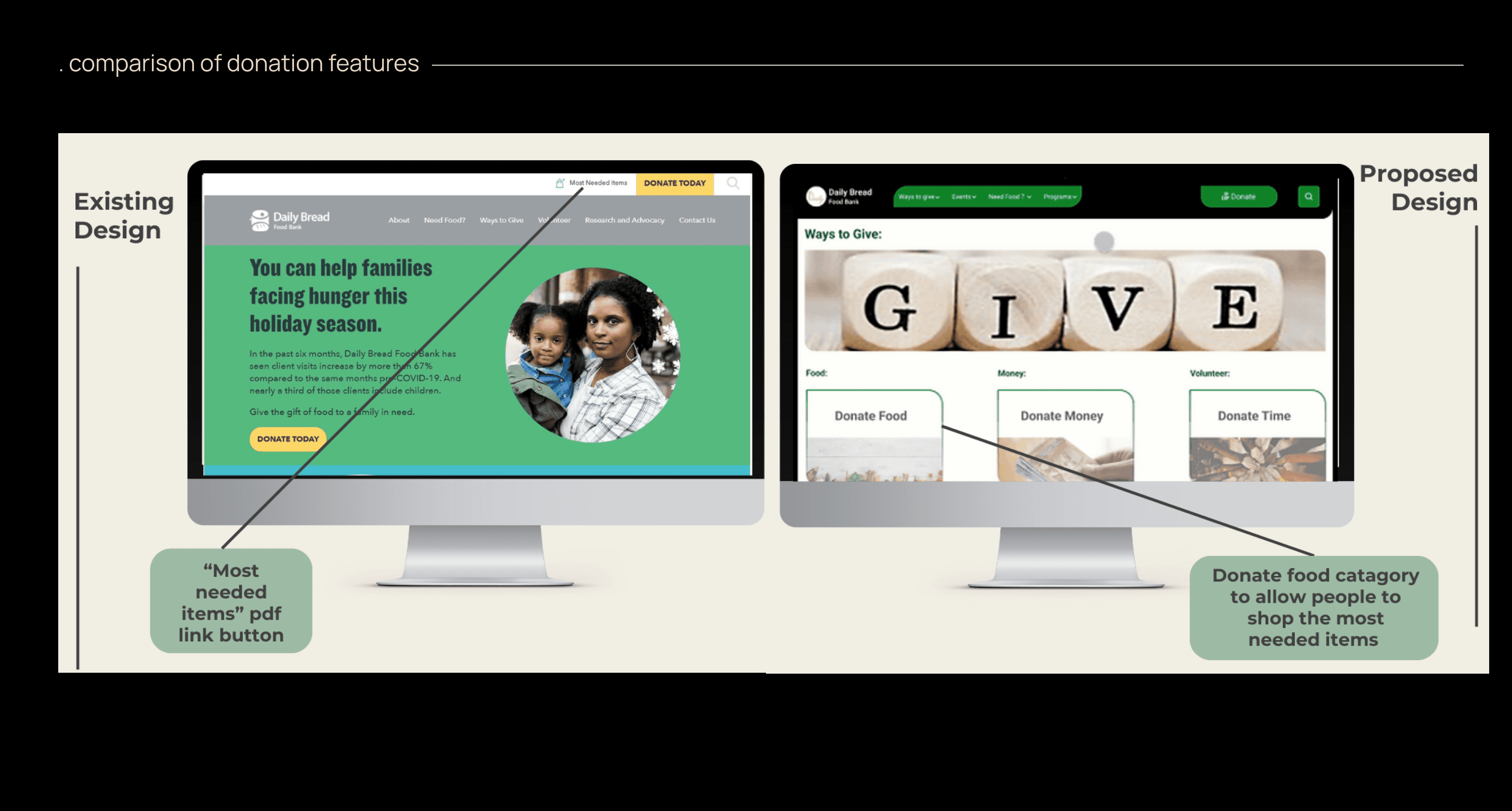
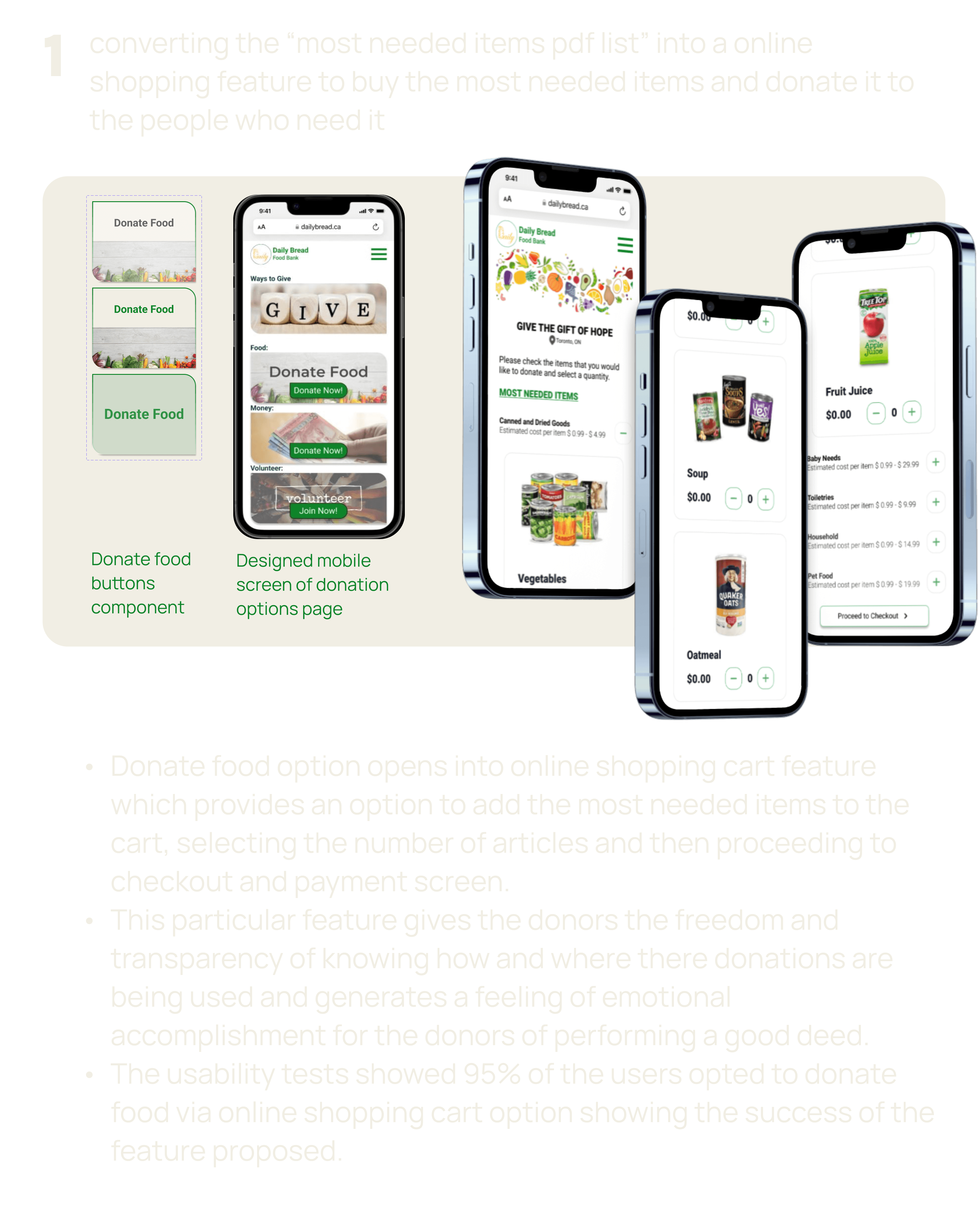
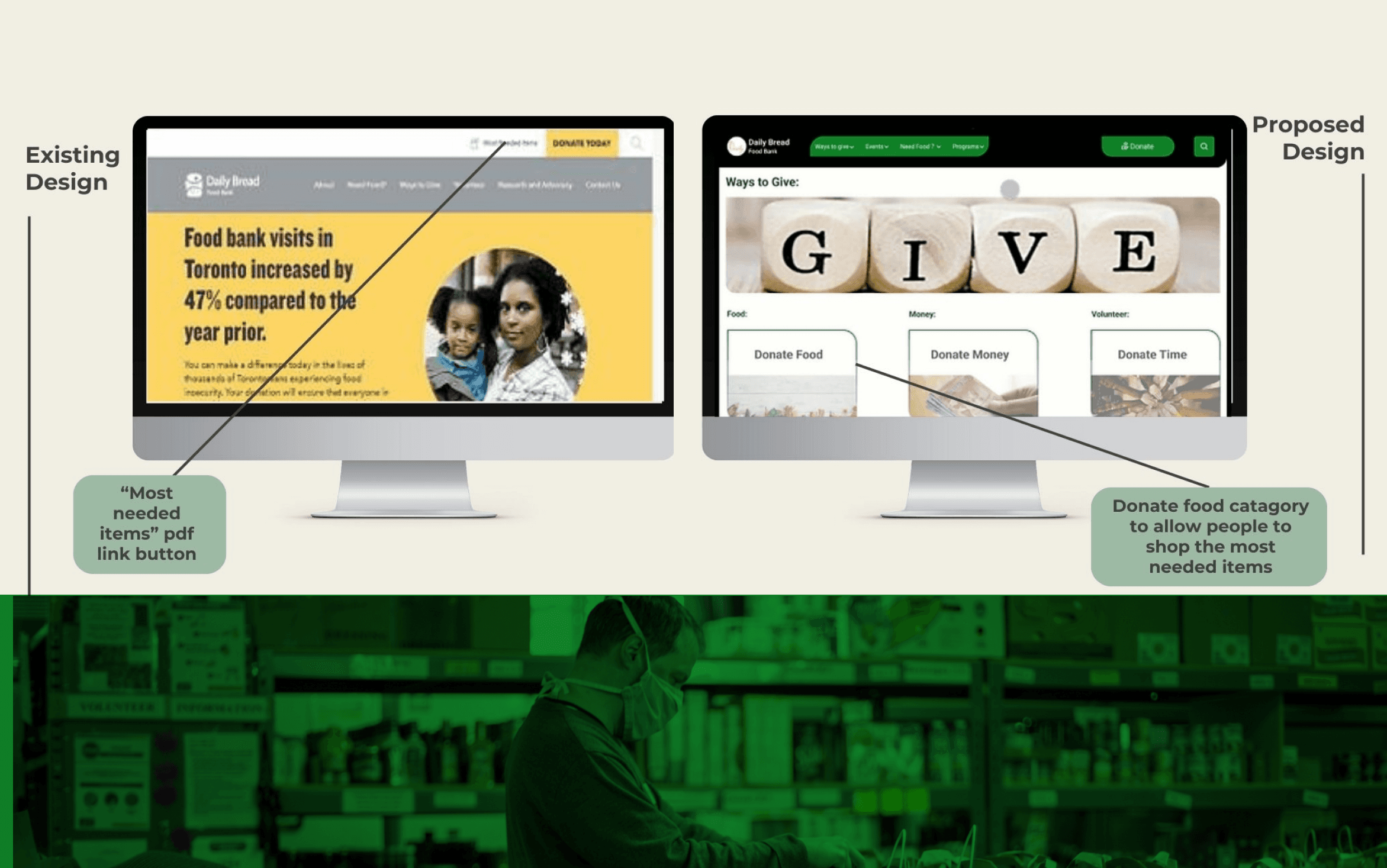
The existing website has a pdf link to the most needed item. We took the opportunity to convert the most needed item list to a shopping cart where users can purchase online and donate the most needed items.
01

The existing website has a pdf link to the most needed item. We took the opportunity to convert the most needed item list to a shopping cart where users can purchase online and donate the most needed items.
01

The existing website has a pdf link to the most needed item. We took the opportunity to convert the most needed item list to a shopping cart where users can purchase online and donate the most needed items.
01

The existing website has a pdf link to the most needed item. We took the opportunity to convert the most needed item list to a shopping cart where users can purchase online and donate the most needed items.
02
The existing website has a pdf link to the most needed item. We took the opportunity to convert the most needed item list to a shopping cart where users can purchase online and donate the most needed items.
02

The existing website has a pdf link to the most needed item. We took the opportunity to convert the most needed item list to a shopping cart where users can purchase online and donate the most needed items.
02

The existing website has a pdf link to the most needed item. We took the opportunity to convert the most needed item list to a shopping cart where users can purchase online and donate the most needed items.
02

The existing website has a pdf link to the most needed item. We took the opportunity to convert the most needed item list to a shopping cart where users can purchase online and donate the most needed items.
03
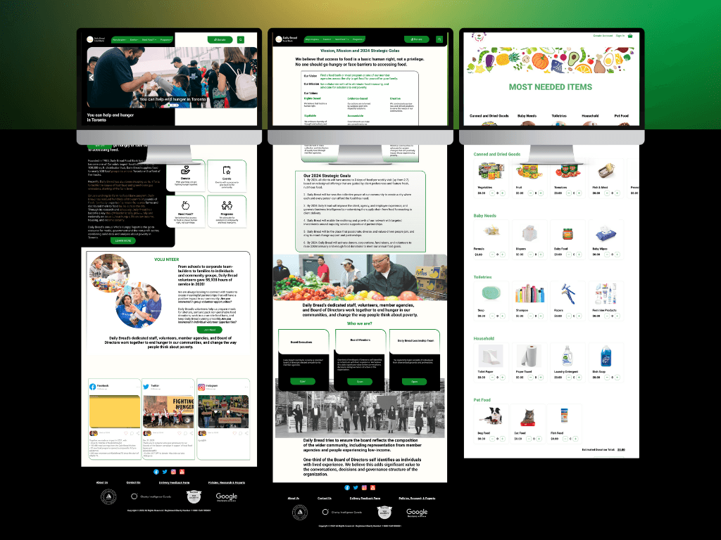
Implementing this shopping cart allows the users to feel like they are making a donation along with having options of the different ways through which they can donate. Implementing these design features gave users the control over where their money is being spent. The 'most needed items' list could be maintained by the Daily Bread and be updated depending on what items were needed at that time. For instance, the food bank could be running low on diapers or formula so "Daily Bread" could highlight these items to notify the users that they are in need of those particular items and then keep alternating the items in the list depending on their supply needs.
03

Implementing this shopping cart allows the users to feel like they are making a donation along with having options of the different ways through which they can donate. Implementing these design features gave users the control over where their money is being spent. The 'most needed items' list could be maintained by the Daily Bread and be updated depending on what items were needed at that time. For instance, the food bank could be running low on diapers or formula so "Daily Bread" could highlight these items to notify the users that they are in need of those particular items and then keep alternating the items in the list depending on their supply needs.
03

Implementing this shopping cart allows the users to feel like they are making a donation along with having options of the different ways through which they can donate. Implementing these design features gave users the control over where their money is being spent. The 'most needed items' list could be maintained by the Daily Bread and be updated depending on what items were needed at that time. For instance, the food bank could be running low on diapers or formula so "Daily Bread" could highlight these items to notify the users that they are in need of those particular items and then keep alternating the items in the list depending on their supply needs.
03

Implementing this shopping cart allows the users to feel like they are making a donation along with having options of the different ways through which they can donate. Implementing these design features gave users the control over where their money is being spent. The 'most needed items' list could be maintained by the Daily Bread and be updated depending on what items were needed at that time. For instance, the food bank could be running low on diapers or formula so "Daily Bread" could highlight these items to notify the users that they are in need of those particular items and then keep alternating the items in the list depending on their supply needs.
Success Analysis
To assess the effectiveness of our product, I initiated another round of interviews with a focus on key tasks and the outcomes from these interviews reveal a compelling narrative of the positive impact resulting from our design enhancements:
Enhanced Trust in the New Design: 80% of users expressed trust in the redesigned layout, significantly improving from the meager 20% trust level associated with the older version. Users found the new layout more comprehensible, instilling greater confidence in the organization's mission.
Comprehensive Community Support Options: A remarkable 100% of users successfully identified various ways to support the community, underscoring the effectiveness of the design in clearly communicating available options.
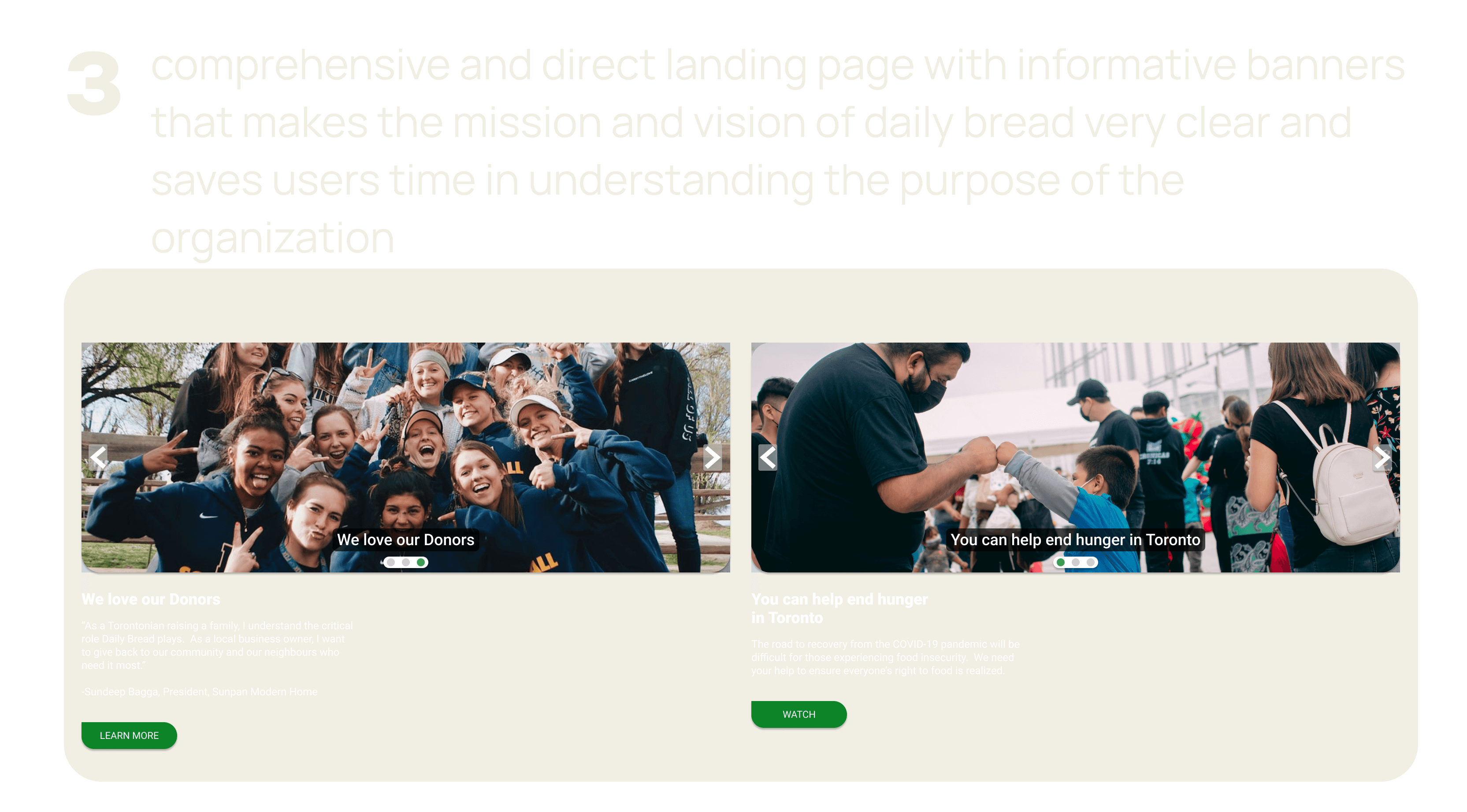
Seamless Donation Process: Notably, 100% of users found it easy to make donations through the newly introduced "donate now" button, highlighting the streamlined and user-friendly nature of the updated design.
These tangible qualitative data points unequivocally validate the success of our endeavors in crafting a more trustworthy, understandable, and user-friendly platform. This outcome is significant for individuals driven by a passion for supporting charitable causes.
.say hello
i'm open for freelance projects, full time roles and happy to collaborate, feel free to email me to see how we can make any of these possible
.say hello
i'm open for freelance projects, full time roles and happy to collaborate, feel free to email me to see how we can make any of these possible
.say hello
i'm open for freelance projects, full time roles and happy to collaborate, feel free to email me to see how we can make any of these possible
.say hello
