menu
a journey towards patient-centric healthcare
a journey towards patient-centric healthcare
a journey towards patient-centric healthcare
a journey towards patient-centric healthcare
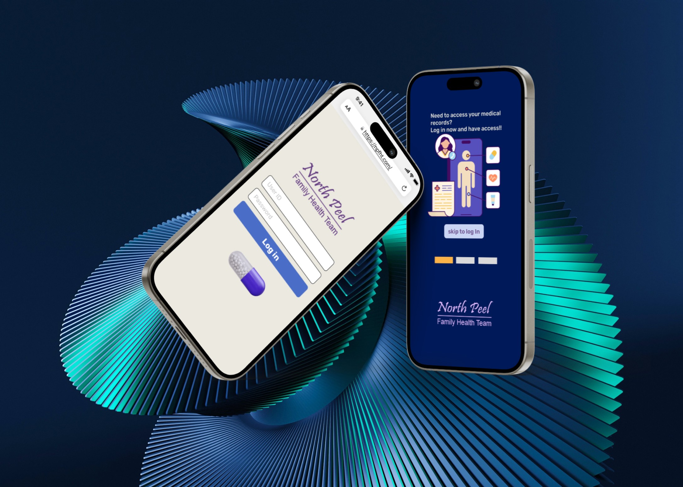
responsive website redesign for "the north peel family health team" to improve the user experience for patients when they contact the health team to either schedule an appointment, view personal health records, or gain wellness information.
responsive website redesign for "the north peel family health team" to improve the user experience for patients when they contact the health team to either schedule an appointment, view personal health records, or gain wellness information.
responsive website redesign for "the north peel family health team" to improve the user experience for patients when they contact the health team to either schedule an appointment, view personal health records, or gain wellness information.
responsive website redesign for "the north peel family health team" to improve the user experience for patients when they contact the health team to either schedule an appointment, view personal health records, or gain wellness information.
00
00

00

00

problem
The current health team website lacks visual coherence, relevant information accessibility, and an efficient means for patients to engage with the healthcare team. This impedes patients in scheduling appointments, viewing health records, and accessing vital health information. The challenge is to enhance the website's design and functionality to facilitate seamless communication between patients and the family health team. How might we improve the website so that our patients will have a better user experience when contacting the family health team to either schedule an appointment, view their health records, or access important health and wellness information?
solution
Revamp the health team website by implementing a visually cohesive design, prioritizing essential information accessibility. Integrate a clear and intuitive navigation system for streamlined appointment scheduling, health record viewing, and access to crucial health information. Enhance user engagement through interactive elements and ensure the website's responsiveness across devices. The solution aims to provide a user-friendly experience, directly addressing the identified issues and optimizing patient interaction with the family health team.
Imagine navigating a website seamlessly to schedule an appointment with your family doctor, accessing your medical records securely, or finding reliable health information at your fingertips. This was the vision guiding our team as we embarked on the redesign of North Peel Family Health's website.
Why NPFH?
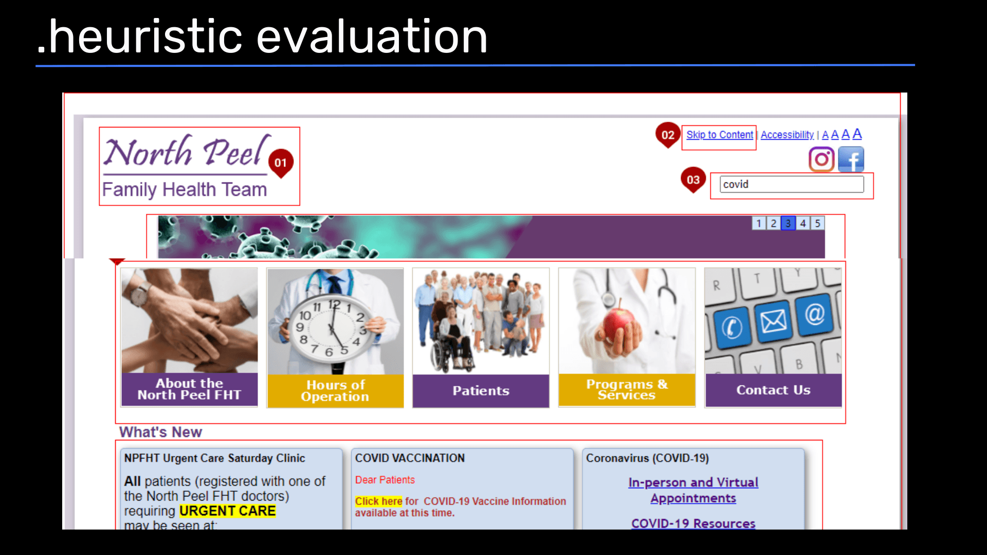
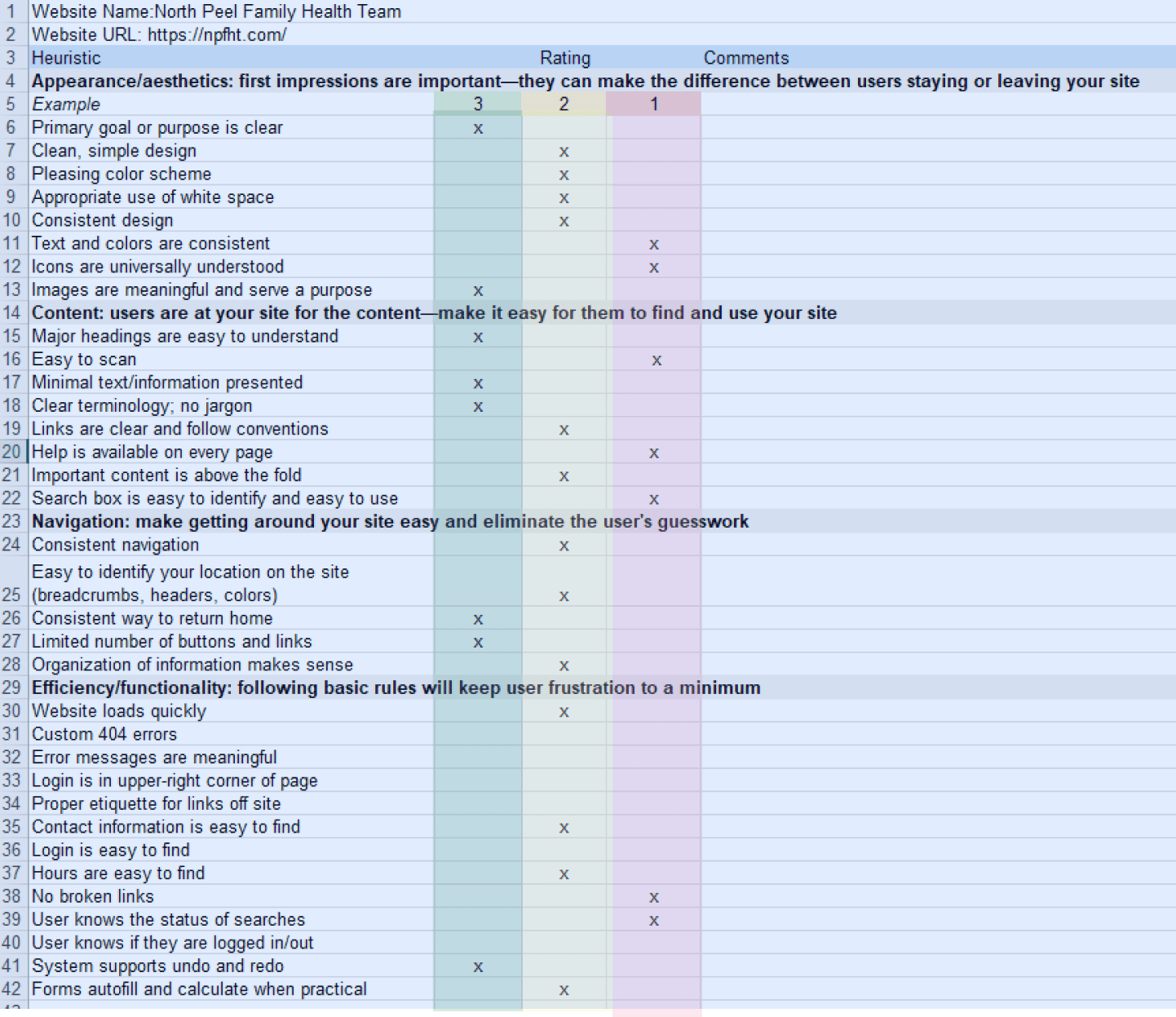
This redesign project was initiated at the request of one of the stakeholders, doctor Manning who was part of the North Peel Family Health Clinic. He provided us with useful insights to consider while doing user tests. Our journey began with a deep dive into understanding the challenges faced by patients when interacting with the existing website. Through surveys, user tests, and heuristic evaluations, we uncovered crucial insights:
Users expressed frustration over the lack of appointment booking functionality,
Users had "limited to no" access to their medical information,
An overwhelming amount of information on the site
There is no call to action on the website or app to book an appointment
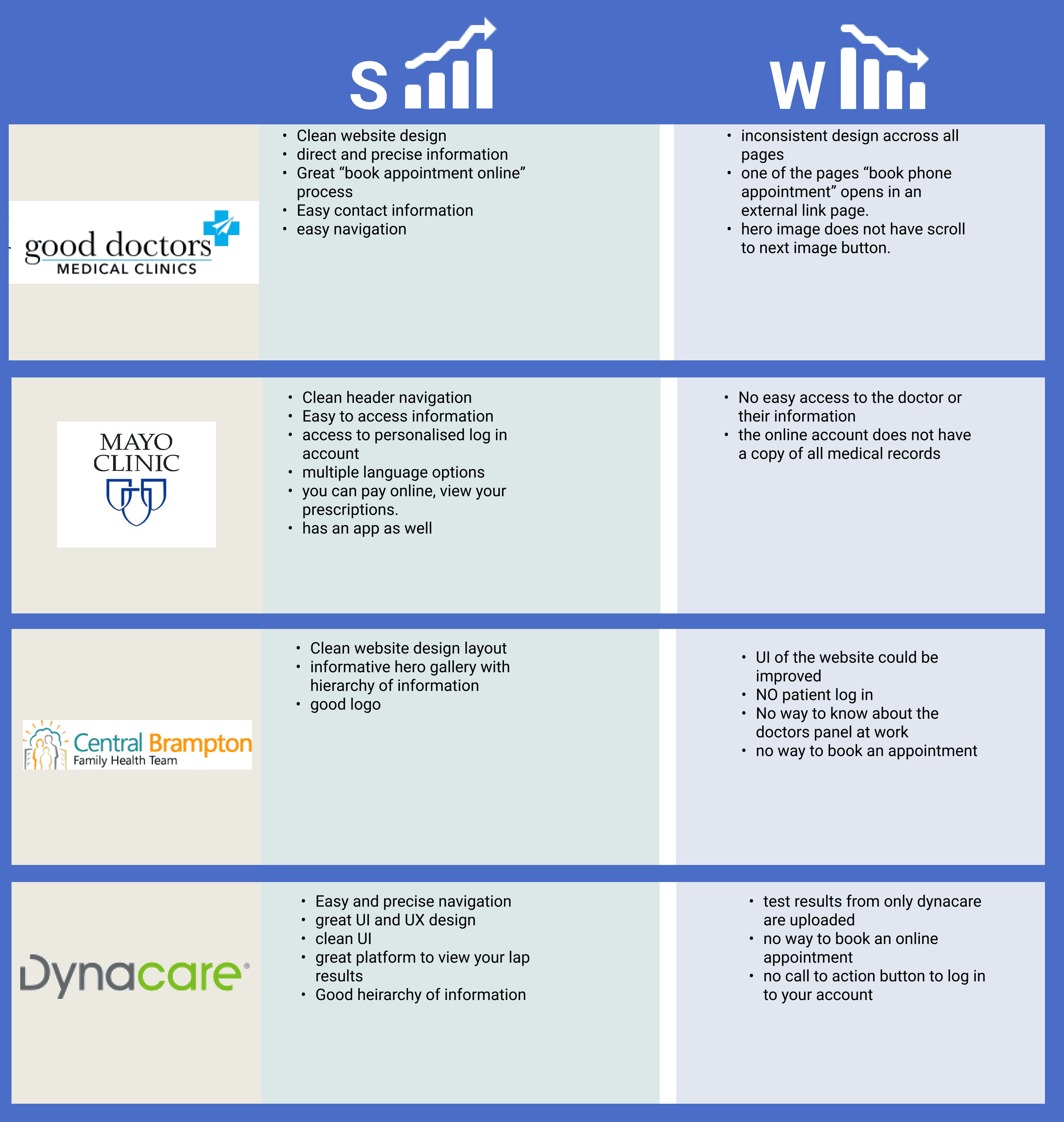
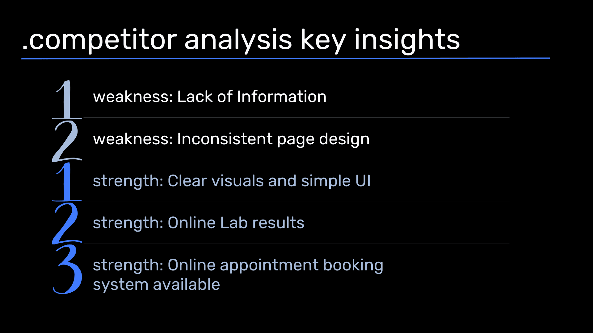
Armed with these insights, we set out to redefine the user experience, but first, we needed to know how our competitors were doing, identifying major flaws in the existing website's navigation and user interface.
.competitor analysis
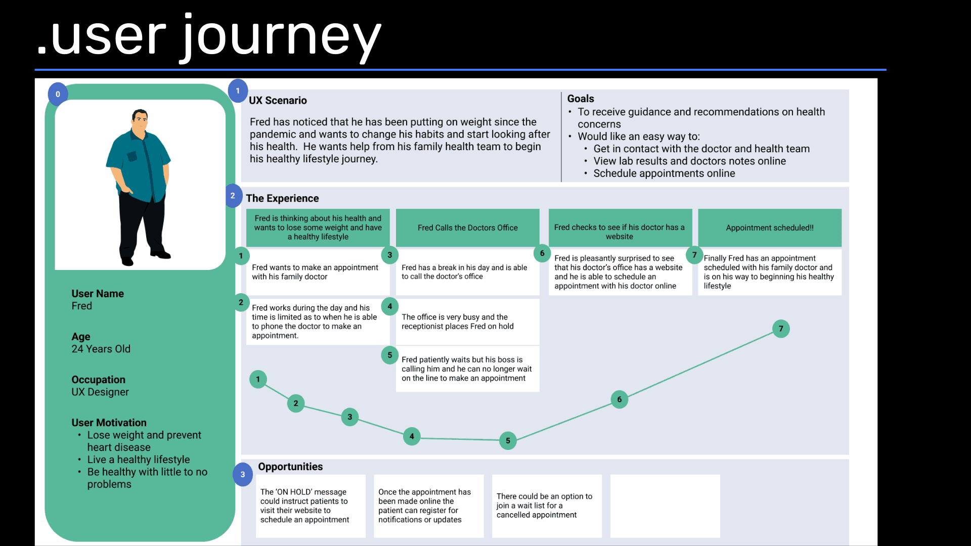
In our redesign process, we comprehensively analyzed the diverse user base of the family health website, encompassing patients, caregivers, doctors, administrative staff, and more, each with unique needs and perspectives. Central to our approach was the creation of a persona named Fred, representing a patient grappling with obesity and underlying health conditions, guiding our design decisions to prioritize his specific requirements from the outset. By anchoring our efforts on Fred's user journey, we ensured a tailored and empathetic redesign that addressed the core concerns of our target audience.
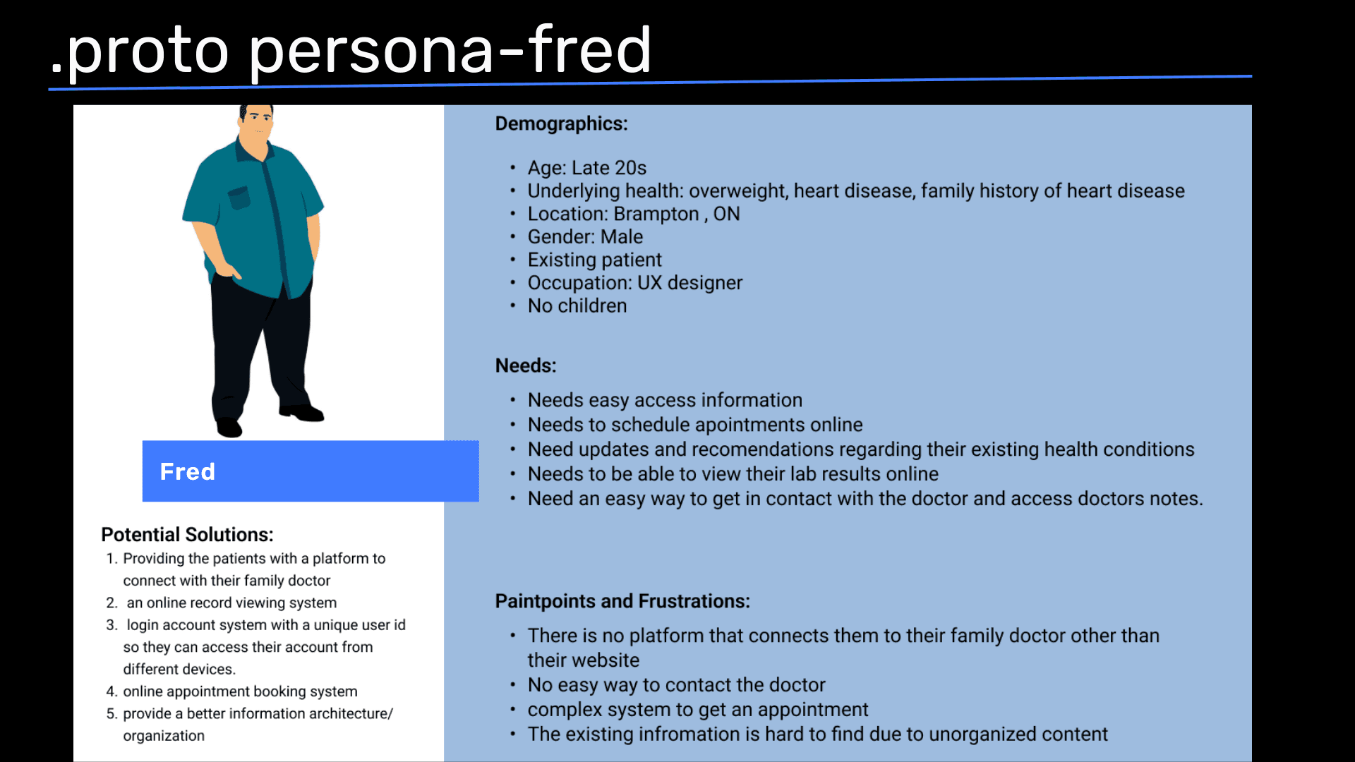
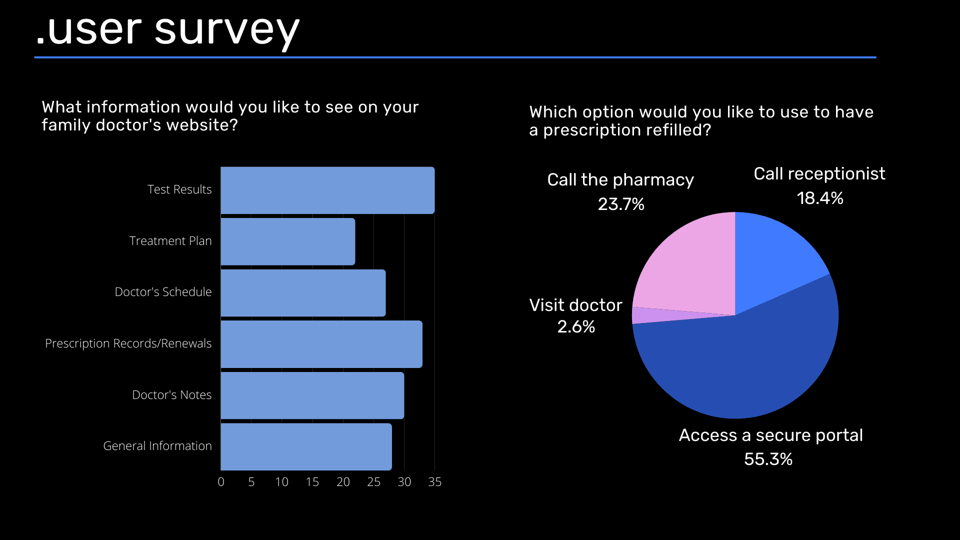
Conducted in-depth interviews with 35 individuals matching Fred's profile, yielding valuable survey insights that directly influenced the refinement of our MVP into a Minimal Viable Product. Key features identified to be essential for our website redesign include:
Implementation of a secure patient portal encompassing prescriptions, doctors' notes, treatment plans, and test results to enhance user privacy and convenience.
Integration of a prominent call-to-action button facilitating users in scheduling doctor appointments swiftly and efficiently.
Provision of updated schedules for doctors, ensuring users have real-time access to appointment availability.
Recommendation of lifestyle-based community platforms or health-related articles by doctors to promote holistic well-being and engagement within the user community.
A streamlined presentation of information, emphasizing brevity and readability to enhance user comprehension and navigation efficiency.
Ideation and Strategic Planning:
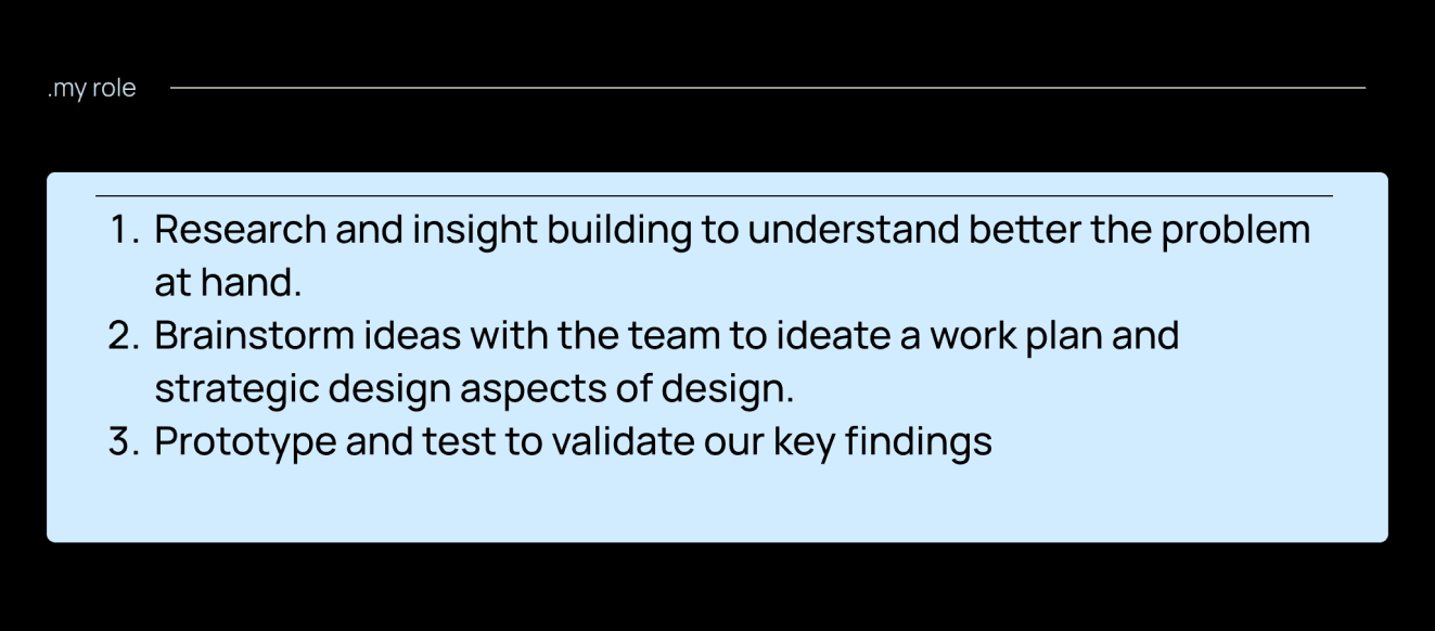
With a clear understanding of our user needs, our team engaged in brainstorming sessions to ideate a comprehensive work plan. We leveraged tools like Gantt charts and Trello to stay organized and meet our deadlines effectively. Collaboratively, we developed a strategic design approach, emphasizing the importance of visual balance, relevant information presentation, and intuitive navigation. We divided our focus of features based on Fred's persona:
on developing a user-friendly password-protected profile dashboard
booking CTA button and doctor schedules
health and wellness-related resources
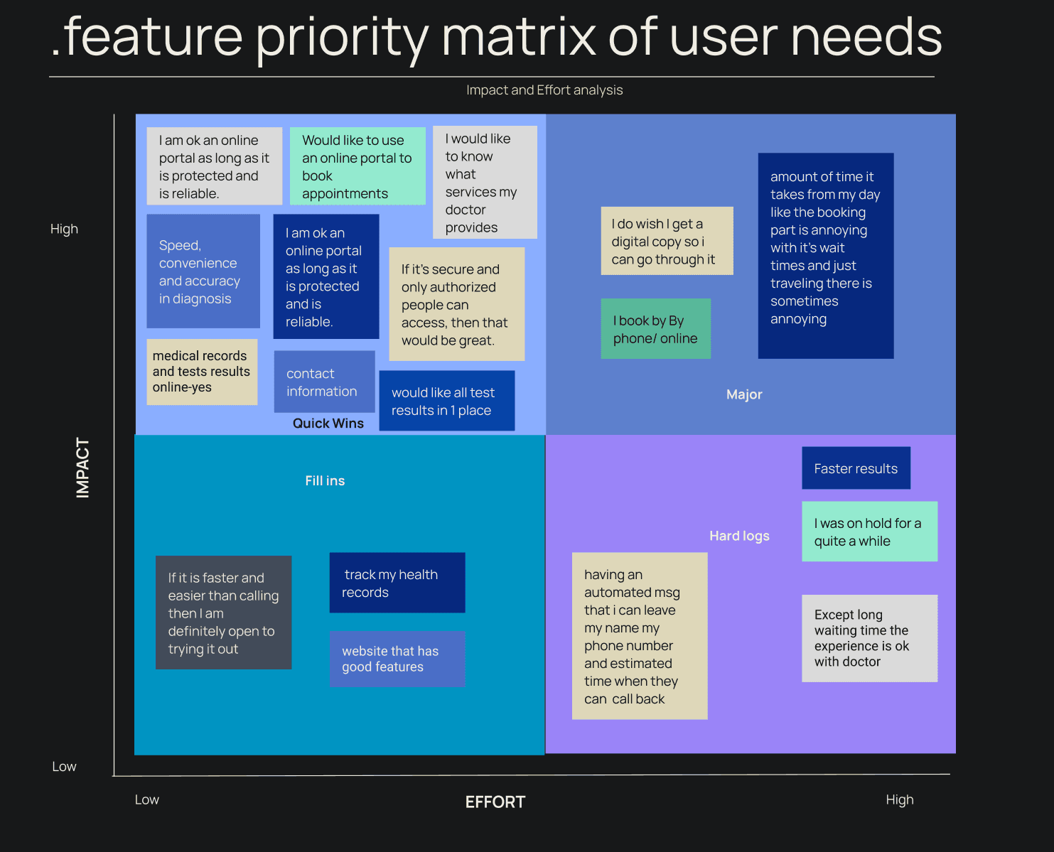
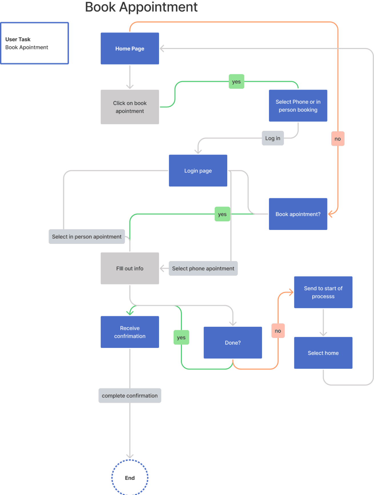
Prototyping and Validation: Translating our ideas into tangible solutions, we developed the information architecture for well-thought-out navigation following our collected data in the feature prioritization matrix followed by the next design process steps of sketching and wireframing before we crafted prototypes that reflected the new informational architecture.
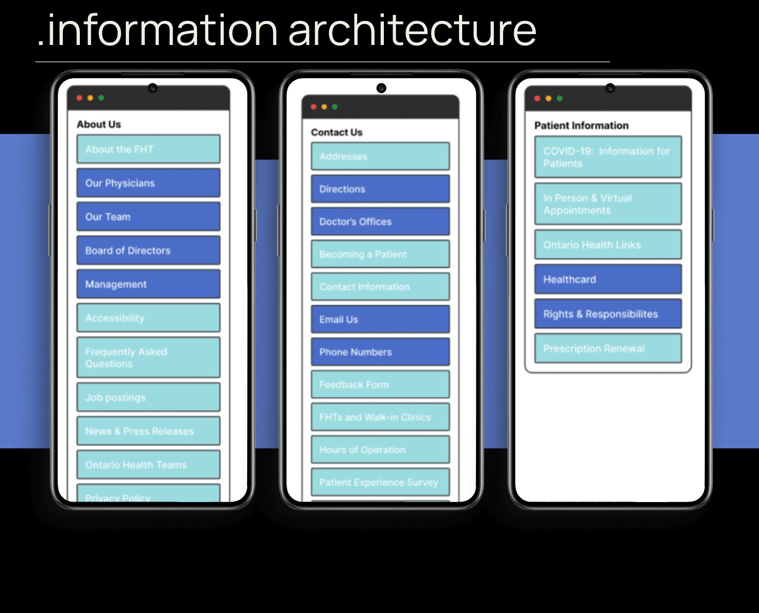
Through iterative testing, we validated our design decisions, ensuring they resonated with user expectations. Usability tests provided invaluable feedback, guiding us in refining the user flow and interface elements.
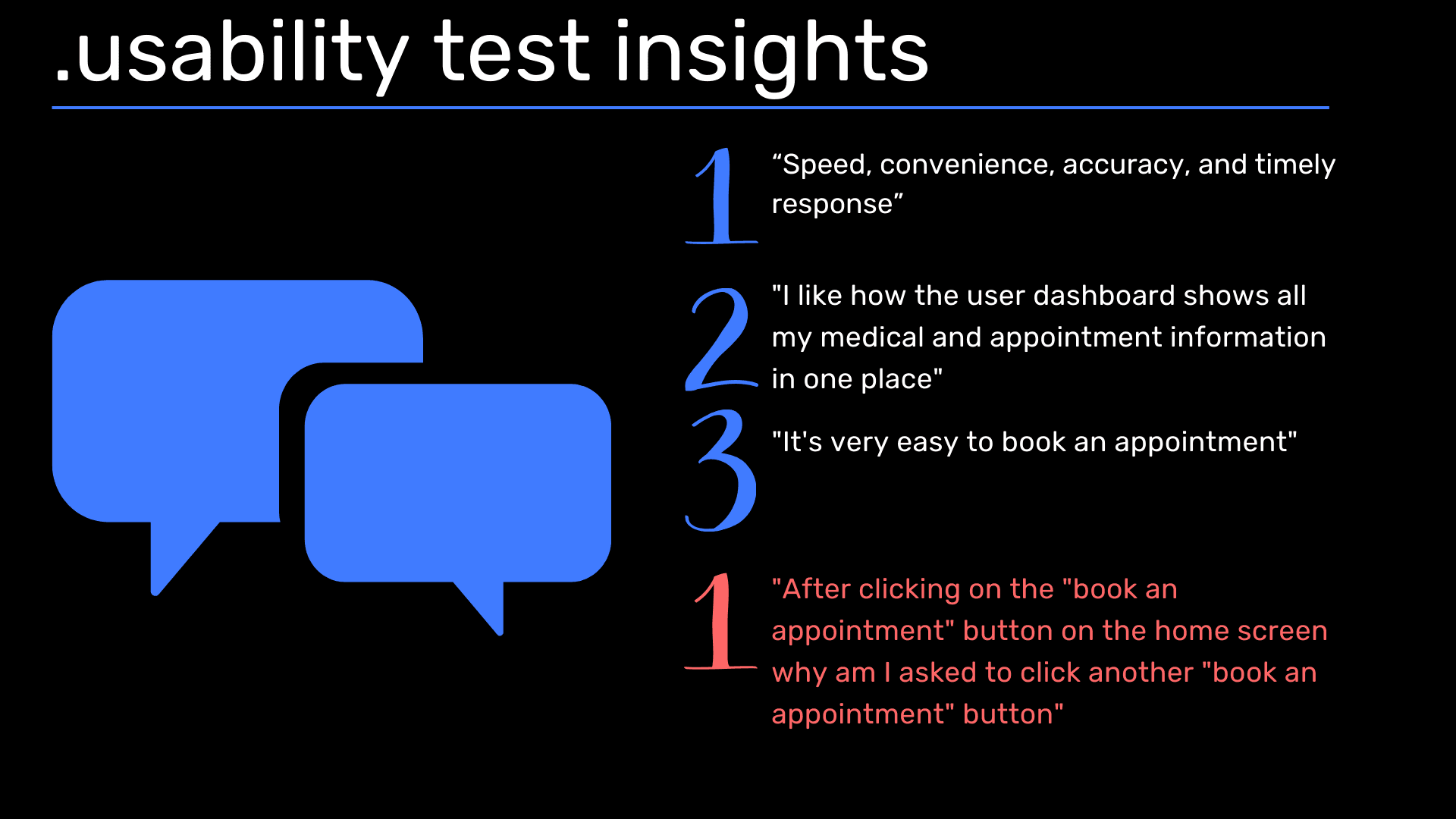
User-Centric Design Solutions: Addressing the key challenges identified during research, we implemented innovative solutions. Introducing a streamlined appointment booking system, we empowered patients to schedule appointments online conveniently. A secure patient portal was integrated, granting users access to their medical records and treatment plans. Additionally, we revamped the website's content structure, prioritizing relevant information and enhancing visual hierarchy for effortless navigation.
type
Health tech
timeframe
6 weeks
tools
Figma, Miro
category
UI/UX


Imagine navigating a website seamlessly to schedule an appointment with your family doctor, accessing your medical records securely, or finding reliable health information at your fingertips. This was the vision guiding our team as we embarked on the redesign of North Peel Family Health's website.
Why NPFH?
This redesign project was initiated at the request of one of the stakeholders, doctor Manning who was part of the North Peel Family Health Clinic. He provided us with useful insights to consider while doing user tests. Our journey began with a deep dive into understanding the challenges faced by patients when interacting with the existing website. Through surveys, user tests, and heuristic evaluations, we uncovered crucial insights:
Users expressed frustration over the lack of appointment booking functionality,
Users had "limited to no" access to their medical information,
An overwhelming amount of information on the site
There is no call to action on the website or app to book an appointment
Armed with these insights, we set out to redefine the user experience, but first, we needed to know how our competitors were doing, identifying major flaws in the existing website's navigation and user interface.
.competitor analysis


In our redesign process, we comprehensively analyzed the diverse user base of the family health website, encompassing patients, caregivers, doctors, administrative staff, and more, each with unique needs and perspectives. Central to our approach was the creation of a persona named Fred, representing a patient grappling with obesity and underlying health conditions, guiding our design decisions to prioritize his specific requirements from the outset. By anchoring our efforts on Fred's user journey, we ensured a tailored and empathetic redesign that addressed the core concerns of our target audience.


Conducted in-depth interviews with 35 individuals matching Fred's profile, yielding valuable survey insights that directly influenced the refinement of our MVP into a Minimal Viable Product. Key features identified to be essential for our website redesign include:
Implementation of a secure patient portal encompassing prescriptions, doctors' notes, treatment plans, and test results to enhance user privacy and convenience.
Integration of a prominent call-to-action button facilitating users in scheduling doctor appointments swiftly and efficiently.
Provision of updated schedules for doctors, ensuring users have real-time access to appointment availability.
Recommendation of lifestyle-based community platforms or health-related articles by doctors to promote holistic well-being and engagement within the user community.
A streamlined presentation of information, emphasizing brevity and readability to enhance user comprehension and navigation efficiency.

Ideation and Strategic Planning:
With a clear understanding of our user needs, our team engaged in brainstorming sessions to ideate a comprehensive work plan. We leveraged tools like Gantt charts and Trello to stay organized and meet our deadlines effectively. Collaboratively, we developed a strategic design approach, emphasizing the importance of visual balance, relevant information presentation, and intuitive navigation. We divided our focus of features based on Fred's persona:
on developing a user-friendly password-protected profile dashboard
booking CTA button and doctor schedules
health and wellness-related resources

Prototyping and Validation: Translating our ideas into tangible solutions, we developed the information architecture for well-thought-out navigation following our collected data in the feature prioritization matrix followed by the next design process steps of sketching and wireframing before we crafted prototypes that reflected the new informational architecture.

Through iterative testing, we validated our design decisions, ensuring they resonated with user expectations. Usability tests provided invaluable feedback, guiding us in refining the user flow and interface elements.

User-Centric Design Solutions: Addressing the key challenges identified during research, we implemented innovative solutions. Introducing a streamlined appointment booking system, we empowered patients to schedule appointments online conveniently. A secure patient portal was integrated, granting users access to their medical records and treatment plans. Additionally, we revamped the website's content structure, prioritizing relevant information and enhancing visual hierarchy for effortless navigation.

type
Health tech
timeframe
6 weeks
tools
Figma, Miro
category
UI/UX


Imagine navigating a website seamlessly to schedule an appointment with your family doctor, accessing your medical records securely, or finding reliable health information at your fingertips. This was the vision guiding our team as we embarked on the redesign of North Peel Family Health's website.
Why NPFH?
This redesign project was initiated at the request of one of the stakeholders, doctor Manning who was part of the North Peel Family Health Clinic. He provided us with useful insights to consider while doing user tests. Our journey began with a deep dive into understanding the challenges faced by patients when interacting with the existing website. Through surveys, user tests, and heuristic evaluations, we uncovered crucial insights:
Users expressed frustration over the lack of appointment booking functionality,
Users had "limited to no" access to their medical information,
An overwhelming amount of information on the site
There is no call to action on the website or app to book an appointment
Armed with these insights, we set out to redefine the user experience, but first, we needed to know how our competitors were doing, identifying major flaws in the existing website's navigation and user interface.
.competitor analysis


In our redesign process, we comprehensively analyzed the diverse user base of the family health website, encompassing patients, caregivers, doctors, administrative staff, and more, each with unique needs and perspectives. Central to our approach was the creation of a persona named Fred, representing a patient grappling with obesity and underlying health conditions, guiding our design decisions to prioritize his specific requirements from the outset. By anchoring our efforts on Fred's user journey, we ensured a tailored and empathetic redesign that addressed the core concerns of our target audience.


Conducted in-depth interviews with 35 individuals matching Fred's profile, yielding valuable survey insights that directly influenced the refinement of our MVP into a Minimal Viable Product. Key features identified to be essential for our website redesign include:
Implementation of a secure patient portal encompassing prescriptions, doctors' notes, treatment plans, and test results to enhance user privacy and convenience.
Integration of a prominent call-to-action button facilitating users in scheduling doctor appointments swiftly and efficiently.
Provision of updated schedules for doctors, ensuring users have real-time access to appointment availability.
Recommendation of lifestyle-based community platforms or health-related articles by doctors to promote holistic well-being and engagement within the user community.
A streamlined presentation of information, emphasizing brevity and readability to enhance user comprehension and navigation efficiency.

Ideation and Strategic Planning:
With a clear understanding of our user needs, our team engaged in brainstorming sessions to ideate a comprehensive work plan. We leveraged tools like Gantt charts and Trello to stay organized and meet our deadlines effectively. Collaboratively, we developed a strategic design approach, emphasizing the importance of visual balance, relevant information presentation, and intuitive navigation. We divided our focus of features based on Fred's persona:
on developing a user-friendly password-protected profile dashboard
booking CTA button and doctor schedules
health and wellness-related resources

Prototyping and Validation: Translating our ideas into tangible solutions, we developed the information architecture for well-thought-out navigation following our collected data in the feature prioritization matrix followed by the next design process steps of sketching and wireframing before we crafted prototypes that reflected the new informational architecture.

Through iterative testing, we validated our design decisions, ensuring they resonated with user expectations. Usability tests provided invaluable feedback, guiding us in refining the user flow and interface elements.

User-Centric Design Solutions: Addressing the key challenges identified during research, we implemented innovative solutions. Introducing a streamlined appointment booking system, we empowered patients to schedule appointments online conveniently. A secure patient portal was integrated, granting users access to their medical records and treatment plans. Additionally, we revamped the website's content structure, prioritizing relevant information and enhancing visual hierarchy for effortless navigation.

type
Health tech
timeframe
6 weeks
tools
Figma, Miro
category
UI/UX


Imagine navigating a website seamlessly to schedule an appointment with your family doctor, accessing your medical records securely, or finding reliable health information at your fingertips. This was the vision guiding our team as we embarked on the redesign of North Peel Family Health's website.
Why NPFH?
This redesign project was initiated at the request of one of the stakeholders, doctor Manning who was part of the North Peel Family Health Clinic. He provided us with useful insights to consider while doing user tests. Our journey began with a deep dive into understanding the challenges faced by patients when interacting with the existing website. Through surveys, user tests, and heuristic evaluations, we uncovered crucial insights:
Users expressed frustration over the lack of appointment booking functionality,
Users had "limited to no" access to their medical information,
An overwhelming amount of information on the site
There is no call to action on the website or app to book an appointment
Armed with these insights, we set out to redefine the user experience, but first, we needed to know how our competitors were doing, identifying major flaws in the existing website's navigation and user interface.
.competitor analysis


In our redesign process, we comprehensively analyzed the diverse user base of the family health website, encompassing patients, caregivers, doctors, administrative staff, and more, each with unique needs and perspectives. Central to our approach was the creation of a persona named Fred, representing a patient grappling with obesity and underlying health conditions, guiding our design decisions to prioritize his specific requirements from the outset. By anchoring our efforts on Fred's user journey, we ensured a tailored and empathetic redesign that addressed the core concerns of our target audience.


Conducted in-depth interviews with 35 individuals matching Fred's profile, yielding valuable survey insights that directly influenced the refinement of our MVP into a Minimal Viable Product. Key features identified to be essential for our website redesign include:
Implementation of a secure patient portal encompassing prescriptions, doctors' notes, treatment plans, and test results to enhance user privacy and convenience.
Integration of a prominent call-to-action button facilitating users in scheduling doctor appointments swiftly and efficiently.
Provision of updated schedules for doctors, ensuring users have real-time access to appointment availability.
Recommendation of lifestyle-based community platforms or health-related articles by doctors to promote holistic well-being and engagement within the user community.
A streamlined presentation of information, emphasizing brevity and readability to enhance user comprehension and navigation efficiency.

Ideation and Strategic Planning:
With a clear understanding of our user needs, our team engaged in brainstorming sessions to ideate a comprehensive work plan. We leveraged tools like Gantt charts and Trello to stay organized and meet our deadlines effectively. Collaboratively, we developed a strategic design approach, emphasizing the importance of visual balance, relevant information presentation, and intuitive navigation. We divided our focus of features based on Fred's persona:
on developing a user-friendly password-protected profile dashboard
booking CTA button and doctor schedules
health and wellness-related resources

Prototyping and Validation: Translating our ideas into tangible solutions, we developed the information architecture for well-thought-out navigation following our collected data in the feature prioritization matrix followed by the next design process steps of sketching and wireframing before we crafted prototypes that reflected the new informational architecture.

Through iterative testing, we validated our design decisions, ensuring they resonated with user expectations. Usability tests provided invaluable feedback, guiding us in refining the user flow and interface elements.

User-Centric Design Solutions: Addressing the key challenges identified during research, we implemented innovative solutions. Introducing a streamlined appointment booking system, we empowered patients to schedule appointments online conveniently. A secure patient portal was integrated, granting users access to their medical records and treatment plans. Additionally, we revamped the website's content structure, prioritizing relevant information and enhancing visual hierarchy for effortless navigation.

type
Health tech
timeframe
6 weeks
tools
Figma, Miro
category
UI/UX
.putting the pieces together proposing solutions
.putting the pieces together proposing solutions

.putting the pieces together proposing solutions

.putting the pieces together proposing solutions

01

Redesigning North Peel Family Health's website towards patient-centric healthcare.
01

Redesigning North Peel Family Health's website towards patient-centric healthcare.
01

Redesigning North Peel Family Health's website towards patient-centric healthcare.
01

Redesigning North Peel Family Health's website towards patient-centric healthcare.
02
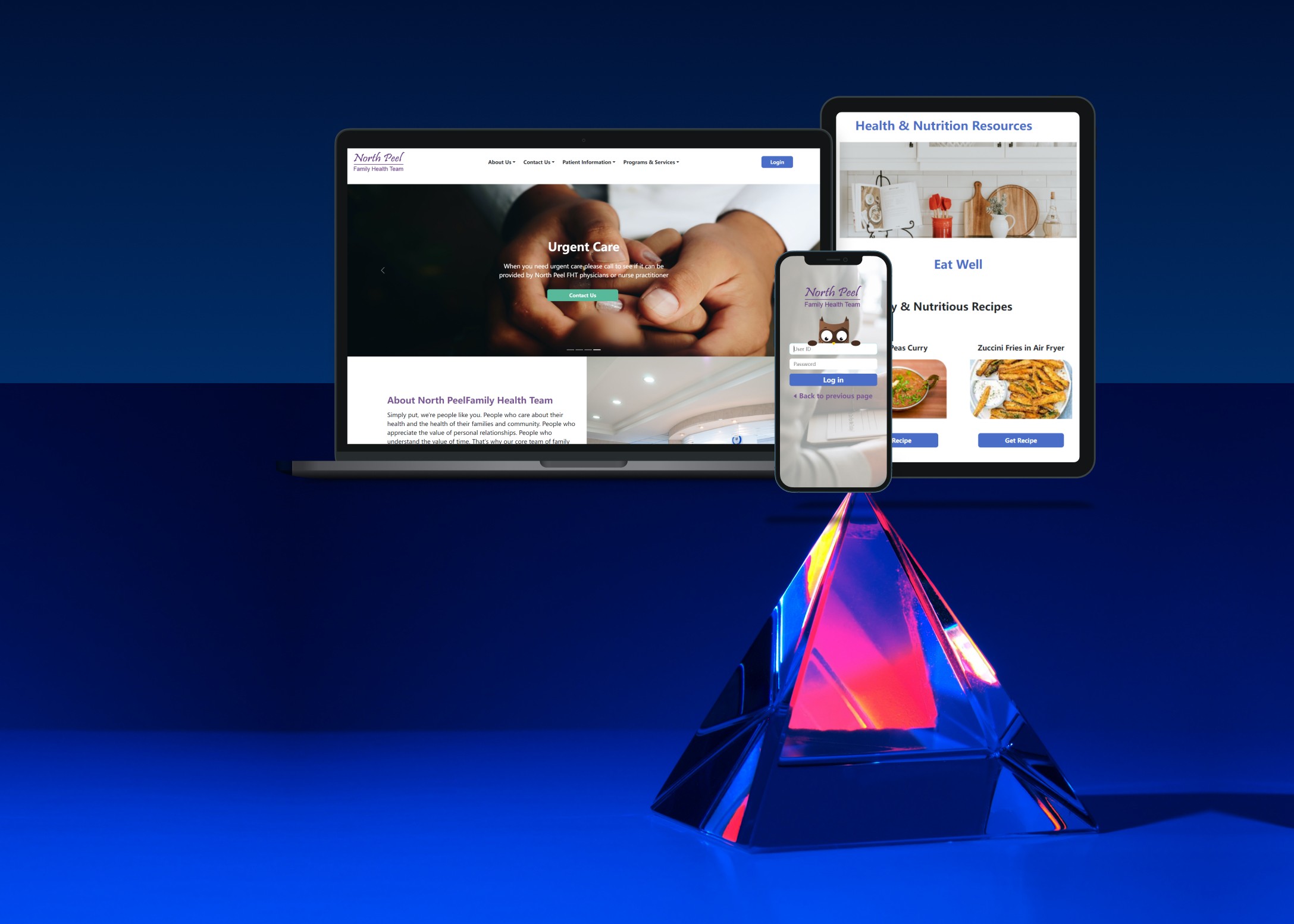
Developing a responsive website for the comfort in use of patients as well as doctors and their administrative staff
02

Developing a responsive website for the comfort in use of patients as well as doctors and their administrative staff
02

Developing a responsive website for the comfort in use of patients as well as doctors and their administrative staff
02

Developing a responsive website for the comfort in use of patients as well as doctors and their administrative staff
03

Final Website redesign for NPFH
03

Final Website redesign for NPFH
03

Final Website redesign for NPFH
03

Final Website redesign for NPFH
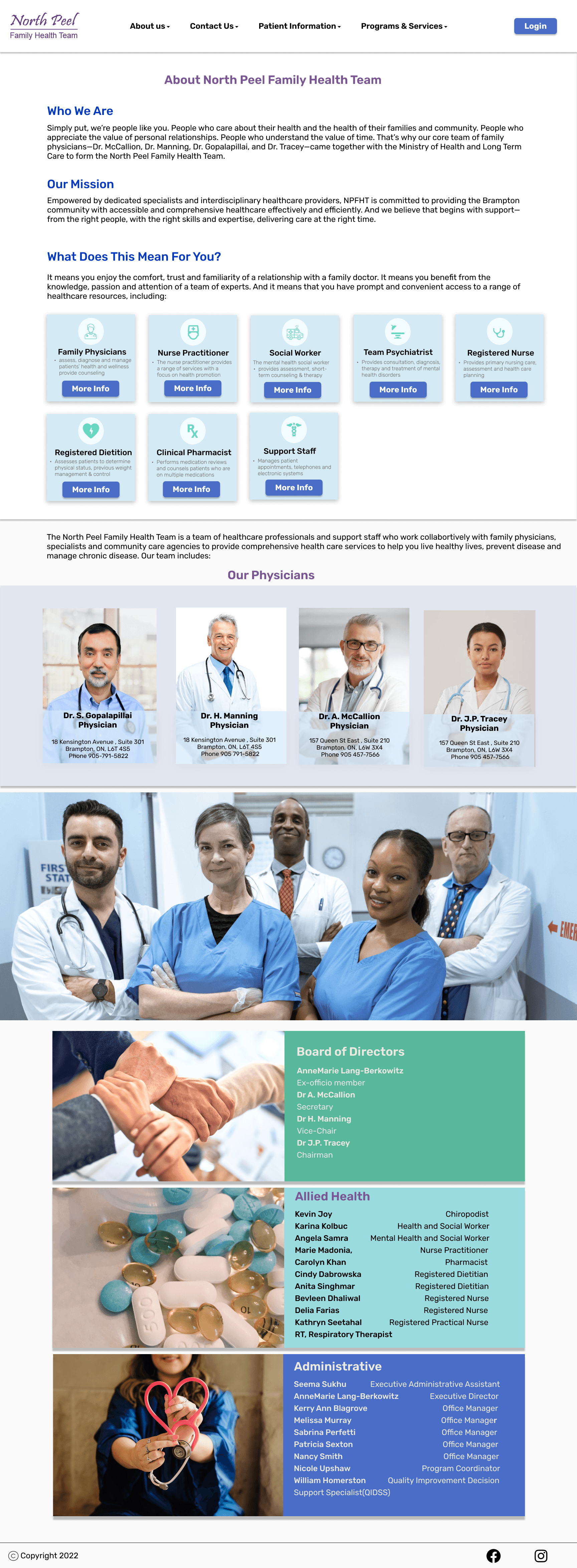
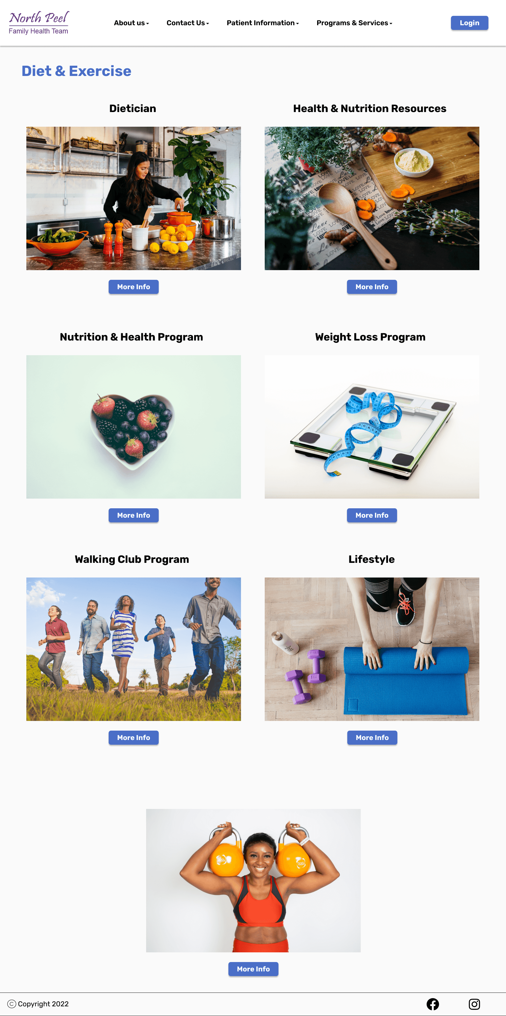
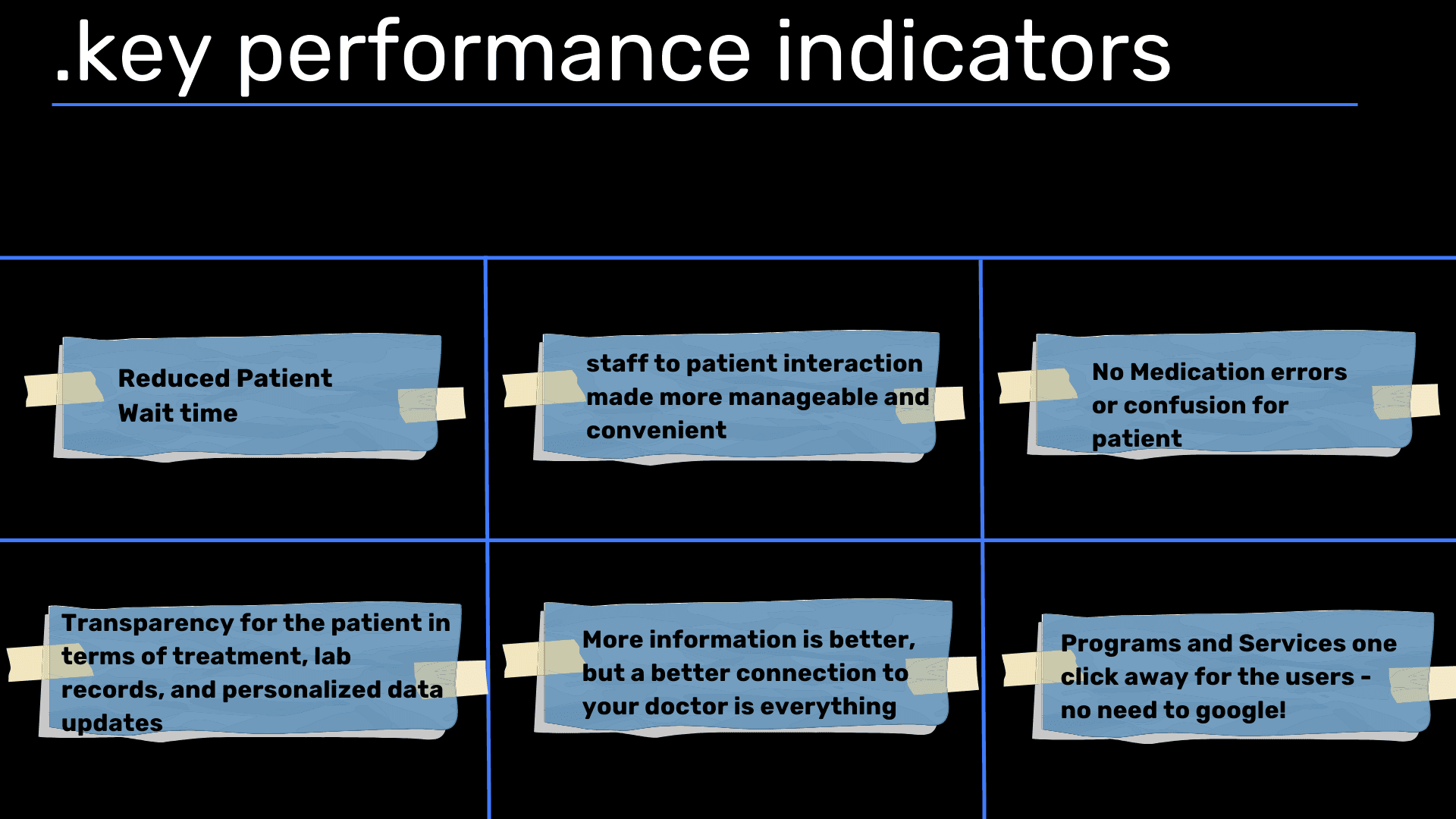
Continuous Improvement and Future Vision: Our journey doesn't end with the website redesign. Embracing a "no fail-learn more" approach, we remain committed to continuous improvement. Moving forward, we envision expanding our impact through the development of a companion app for enhanced doctor-patient interaction. By conducting further usability tests and refining both the website and app interfaces, we aim to elevate the patient experience to new heights.
Conclusion: Redesigning North Peel Family Health's website was more than just a project; it was a journey toward patient-centric healthcare. Through meticulous research, collaborative ideation, and user-centric design, we transformed a digital platform into a beacon of accessibility and empowerment for patients. As we continue to evolve and innovate, our commitment to enhancing the user experience remains unwavering, ensuring every interaction leaves a lasting impression of care and efficiency.
.say hello
i'm open for freelance projects, full time roles and happy to collaborate, feel free to email me to see how we can make any of these possible
.say hello
i'm open for freelance projects, full time roles and happy to collaborate, feel free to email me to see how we can make any of these possible
.say hello
i'm open for freelance projects, full time roles and happy to collaborate, feel free to email me to see how we can make any of these possible
.say hello
